
Optical Store Fit-Out Ideas for a More Refined Customer Experience
Most optical store owners think about design as an aesthetic decision. It is not. The way your store looks, flows, and feels has a direct impact on whether a customer picks up a frame, tries it on, asks for help, and walks out with a purchase. Every design choice either supports that process or quietly works against it.
If you are planning a fit-out or reconsidering your current layout, here is what actually moves the needle.
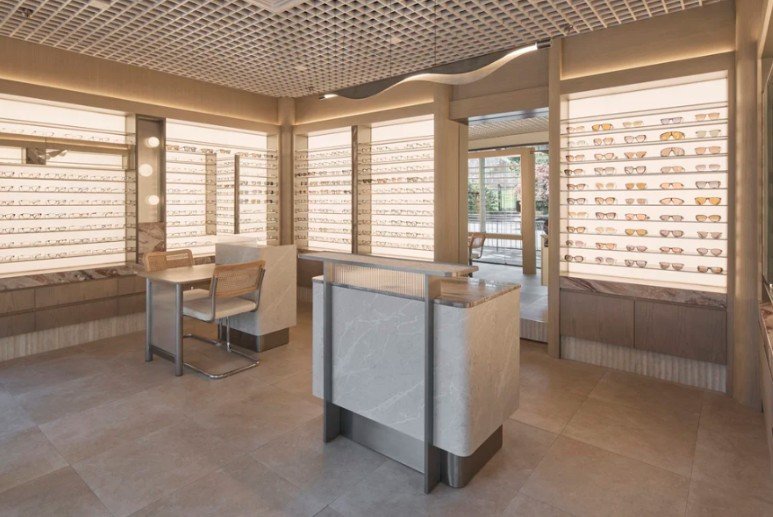
The Entrance Sets the Buying Mood
Customers decide how they feel about a store within seconds of walking in. A cluttered, dim, or visually overwhelming entrance puts people on edge before they have even looked at a single frame.
A refined optical store usually opens with:
- Clear sightlines so customers know where to go
- A feature display or reception point that anchors the space
- Enough breathing room to feel calm rather than cramped
- Lighting that feels welcoming, not clinical
Good optical store fit-out ideas do not start with the display wall. They start at the door.
Layout Either Helps or Hurts You
A confusing layout costs sales. When customers cannot figure out where to browse, where to sit, or where to wait, they disengage. That discomfort is rarely conscious, but it is real.
A layout that works for retail conversion usually includes:
| Zone | Purpose | What It Should Feel Like |
|---|---|---|
| Front area | New arrivals or premium collection | Inviting, uncluttered |
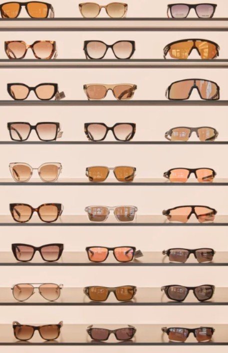
| Wall displays | Main browsing | Eye-level, easy to scan |
| Mirror points | Try-on experience | Spacious, flattering light |
| Consultation area | Staff and customer discussion | Quiet, slightly private |
| Counter/checkout | Final decisions and payment | Clear, calm, unhurried |
When each zone flows into the next, customers move through the store naturally. Staff can guide the experience without it feeling forced. That is the kind of environment where people take their time and spend more confidently.
Lighting Is A Conversion Tool
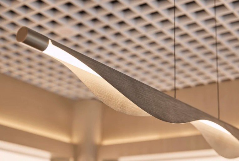
This is where a lot of optical stores get it wrong. Harsh overhead lighting looks clinical. Flat or dim lighting makes frames harder to evaluate and mirrors less flattering. Neither of those outcomes helps a customer feel good about a purchase.
A more balanced approach works better:
- General lighting creates overall comfort and visibility
- Focused lighting draws attention to displays and try-on mirrors
- Mirror lighting should be soft and even, never harsh or shadowed
A well-planned optical shop fit-out treats lighting as a functional tool, not a finishing touch. In a store where customers are deciding how something looks on their face, lighting is everything.
Materials Shape the Perception of Value
Customers may not notice your joinery finishes consciously, but they absolutely notice the impression those finishes create. Cheap-looking surfaces undermine the value of even a premium frame range. Overly trendy materials date quickly and can make a store feel dated within a few years.
The strongest fit-outs tend to use a restrained, timeless palette:
| Material | Why It Works |
|---|---|
| Timber | Warm, approachable, durable |
| Stone-look finishes | Premium feel without high maintenance |
| Brushed metals | Modern but not cold |
| Soft neutrals | Lets the frames do the talking |
| Textured surfaces | Adds depth without visual noise |
The Bright Eyes Optics project by Al & Co is a practical example of this done well. A calm, curated interior built around timeless materials that supports a more luxurious retail experience without feeling overdone.
Give Customers Space to Decide
Optical retail is not a quick transaction. People browse, compare, try on, ask for a second opinion, and then try on the same pair again. A store that rushes that process, or makes it physically awkward, loses sales it should have won.
Simple changes that support the decision-making process:
- Mirrors with enough surrounding space to step back and look properly
- Seating near display areas so customers can browse without feeling rushed
- Display spacing that does not force frames too close together
- Consultation zones with a little more privacy for deeper conversations
- Counters that feel clear and unhurried, not cluttered with point-of-sale material
These are not luxury upgrades. They are the basics of a store designed around how customers actually behave.
The Space Should Sell the Brand Before Staff Say A Word
Strong optical shop interior design tells customers what kind of business they are dealing with before anyone speaks to them. A premium eyewear range needs an interior that supports that positioning. A family-focused practice needs warmth alongside professionalism. A fashion-led brand needs a space that reflects that energy.
This is the thinking behind Al & Co’s commercial interior design service. Every fit-out is shaped around the specific business, not a generic template. That means tailored planning, considered material selection, lighting that works for the space, and layouts built around how customers and staff actually move through the store.
A refined optical store does not need to be expensive. It needs to be coherent. When layout, lighting, materials, and brand identity all point in the same direction, the result is a store that feels easier to shop in, builds trust faster, and converts more browsers into buyers.
That is what good optical retail design delivers.