There was a time when everyone had a built-in bathtub, for better or worse. Often cheap acrylic drop-ins, it’s not a huge surprise that the trend for freestanding tubs came along and captured our collective imagination, bringing the spa-like experience of a hotel to our homes.
However, these trends go around in circles, and now, for many architects and interior designers, a built-in bath is often the preferred option. ‘We usually prefer a built-in tub,’ says Carlos Naude, founder of Working Holiday Studio, for example. ‘We think is more comfortable and we like the tile to be the ‘hero’ of each one of our bathroom projects.’
Generally speaking, it’s true that drop-in tubs are more practical than freestanding ones. There’s space for your shampoo and shower gel around the edge, for example, while it’ll also help keep your splash zone contained and make it much more practical to bathe children, too.
If that’s not enough to convince you, then you might be interested to know that in this writer’s humble opinion, they also just look better than freestanding baths. To prove my point, here are 10 of the very best, most creative and unusual built-in baths to showcase what’s possible in a modern bathroom.

Hugh Metcalf
Hugh is Livingetc.com’s deputy editor and an experienced interiors journalist. He’s a big believer in the beauty of a built-in bathtub, and has collected 10 of his favorite to showcase what they’re capable of.
10 of the best built-in bathtub ideas
With a built-in bathtub, there’s often an inherent minimalism to the design. Instead of a freestanding tub that is bringing it’s own character to the space, a built-in becomes part of the architecture, and designers often use this to good effect.
1. This all-tiled beauty
(Image credit: Working Holiday Studio)
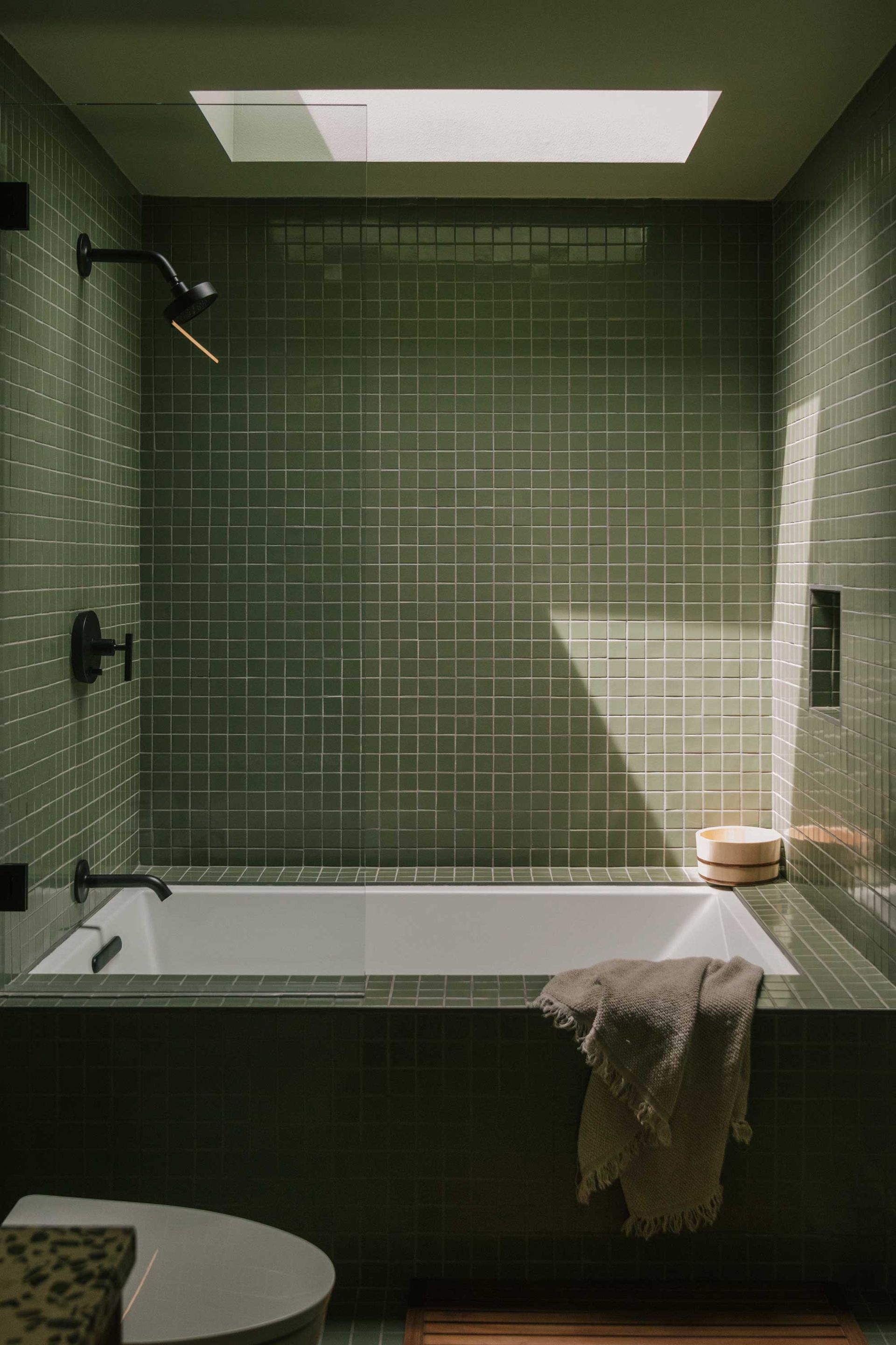
‘We consider ourselves somewhat minimalists, and for this project specifically we wanted to embrace the monochromatic look as we wanted to crate a serene space throughout the house,’ explains Carlos Naude (opens in new tab), co-founder of Los Angeles-based Working Holiday Studio of this tiled green bathroom.
The tile runs throughout the space, on the shower walls, bath panel and even the flooring, reducing the materiality and bringing a minimalist quality to it. The bath has also been given generous edges, making it comfortable to use for storing shower soap and shampoo, or even propping a phone if you like to indulge in some TV while soaking in the bathtub.
2. This small bathroom that feels surprisingly spacious
(Image credit: Jeremie Warshafsky. Design: Studio AC)
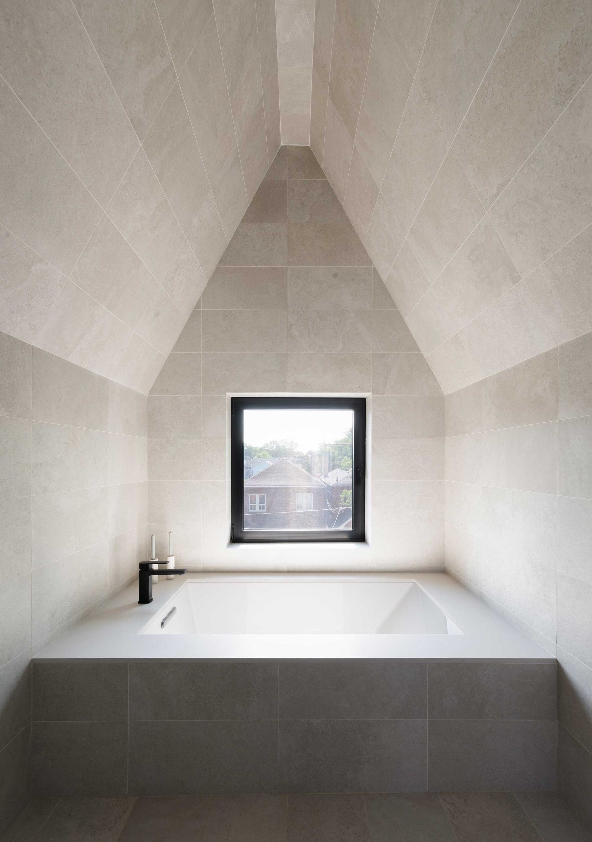
When trying to fit a freestanding bath into a small bathroom, it can easily feel cramped, even if you choose a smaller style of tub to fit the room. A built-in bath removes the visual noise, helping you to introduce a bath that works with the dimensions of the room.
In this wet room created by Canadian design practice StudioAC (opens in new tab), the whole space has been wrapped in concrete tiles, while the bathtub itself spans the narrow width of the space, helping what is actually a smaller tub feel generous and luxurious. It sits adjacent to a wet room shower that helps get dual functionality out of this small space.
3. This bathroom with with a split tub and shower layout
(Image credit: Tom Ferguson. Design: Studio P)
Some people are more comfortable with true wet rooms than others, but there are plenty of small bathroom layouts that you can implement with a built-in bathtub to ensure your space has the best of both worlds and includes a shower too.
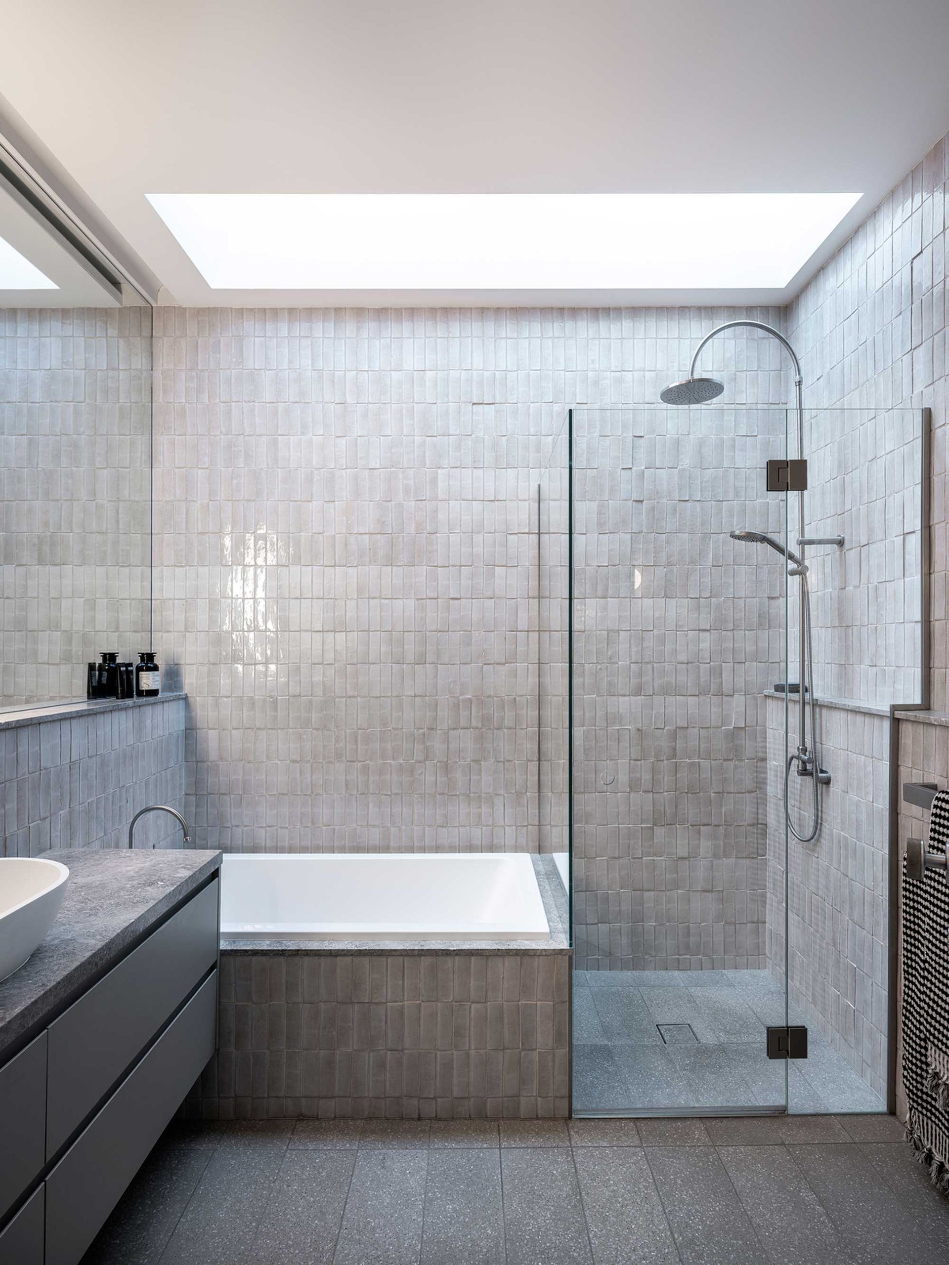
This bathroom by Studio P is a great example of a layout that splits one wall into a tub and shower. ‘The bath had to be small due to the requirement not have have a combined bath shower and the restricted size of the bathroom and the overall home, but it’s wonderfully deep and comfortable,’ explains interior architect Arwen Sachinwalla (opens in new tab). ‘It is not square but a small rectangular shape that has been tiled into the walls for simplicity and to look like it is almost moulded out of the wall.’
Many of the bathtubs featured here sit under a skylight, offering a soak with a view. ‘We used the large skylight to create a sense of spaciousness and delight in place of grandeur,’ Arwen says. ‘By bringing the sky and sun into the room, it emulates an outdoor bathing experience, where there is no ceiling – only sky.’
4. This bathroom with a curved corner bathtub
(Image credit: Hervé Goluza. Design: Space Factory)
Positioning a bathtub in the corner of the room can be a challenge to make look good. After all, if the bathtub sets the tone for your space, tucking it away, apologetically, can make it feel like your layout has been an afterthought.
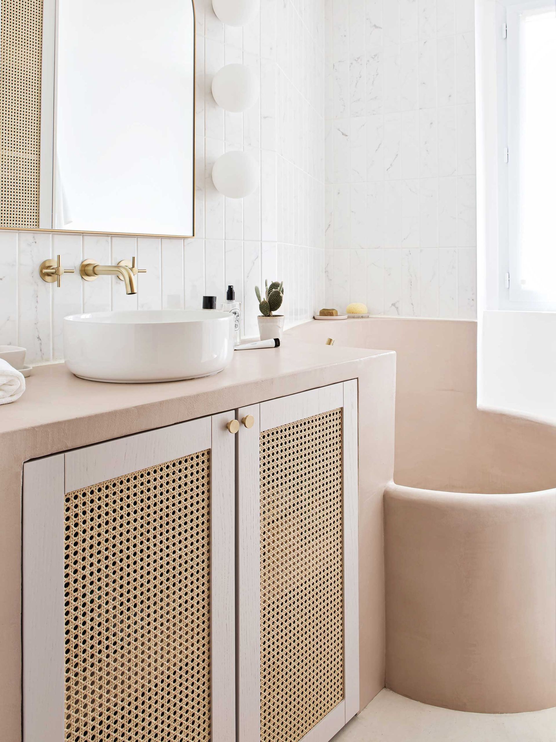
However, this example by French design studio Space Factory showcases a unique approach to creating a corner bath in a small bathroom. ‘We wanted a specific design that shows the craftsmanship behind this rounded bath, which allowed us to make the most of the available space,’ explain Ophélie Doria and Edouard Roullé-Mafféïs (opens in new tab), co-founders of the interior design studio. ‘We were inspired by a trip to Japan where we visited “onsen” where bathing is an art form. The built-in bath is finished with waxed concrete from Mercadier,’ they add.’
5. This pink, ‘easy-access’ bathtub
(Image credit: Anson Smart. Design: Greg Natale)
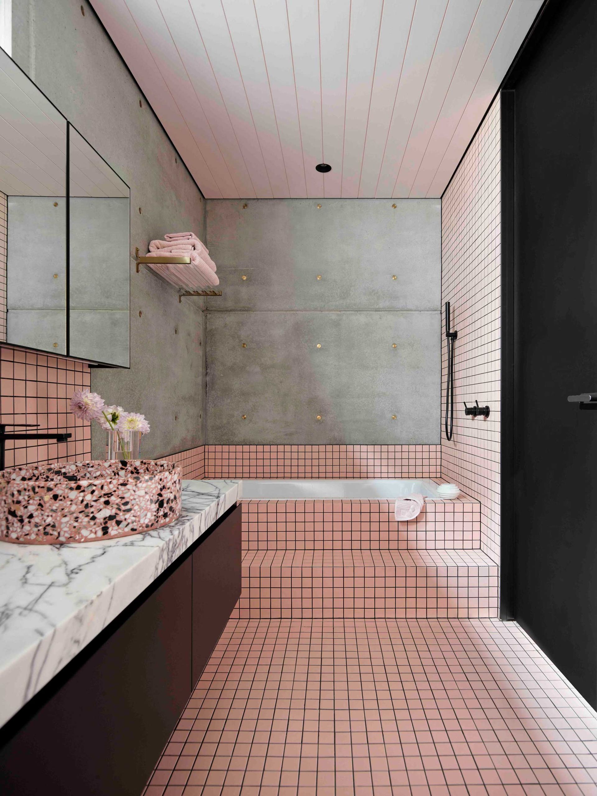
For a way to give a built-in bathtub more presence in your scheme, consider a design like this one by Australian interior designer Greg Natale (opens in new tab). It’s another scheme that makes use of bathroom tile across the walls, floors and bath surround, but it also incorporates a tiered step up to the bathtub itself.
It’s not only a visually arresting addition, but it’s practical, too. It means you can perch in the bathroom, while creating the ideal ledge if you need to use your tub to bathe the kids (or even wash a dog, dare we say), while also making it easier to get in and out of the bath for adults.
6. This earthy Tadelakt bathroom
(Image credit: Huxley Architects)
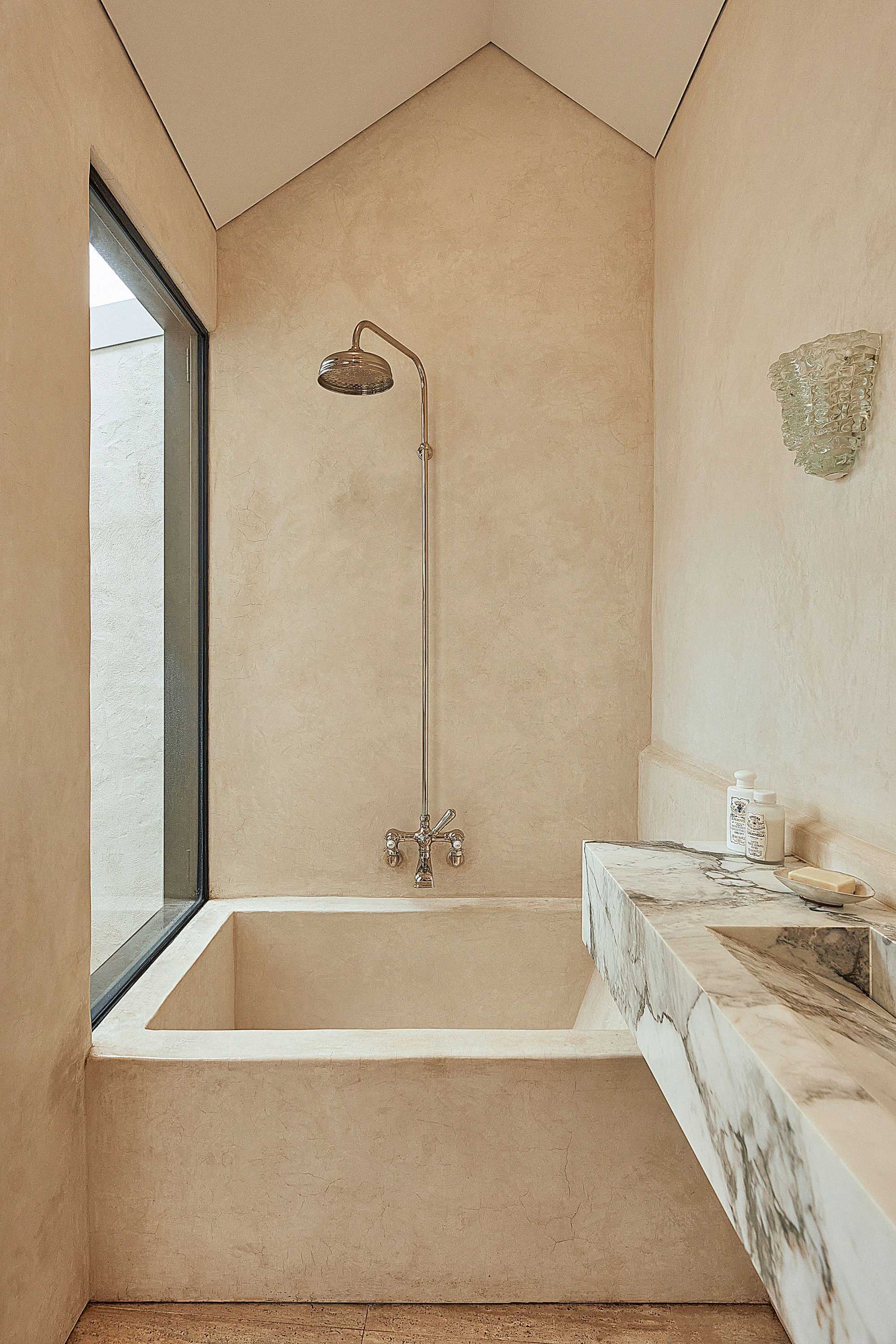
Restraining the palette of materials in a small bathroom is a powerful shortcut to making it feel larger and help big elements like a bathtub recede. That was the goal of architect Richard Huxley (opens in new tab) of Sydney-based Huxley Architects, who designed this bathroom finished with Tadelakt lime render across the walls and bathtub.
‘The brief for the bathroom aesthetically was to create a space with a sense of relaxed luxury with a focus on natural, artisanal finishes,’ Richard explains. ‘Tadelakt lime render was specified for the walls and bespoke bath to limit the palette of finishes in order to allow conversation between the texture and tonality of marble, travertine and Tadelakt to take place.’ It’s a material that creates textured bathroom walls that are an antidote to the clinical nature of white porcelain tiles, often used as standard in these spaces.
‘Additionally, it was important that the bath belonged to the room and did not overpower the composition,’ Richard adds. ‘By rendering the bath as an extension of the wall, it became robust enough to belong, while being respectful to the other elements in the room.’
7. This bathroom with amazing marble surfaces
(Image credit: Manolo Langis. Design: Mandy Graham)
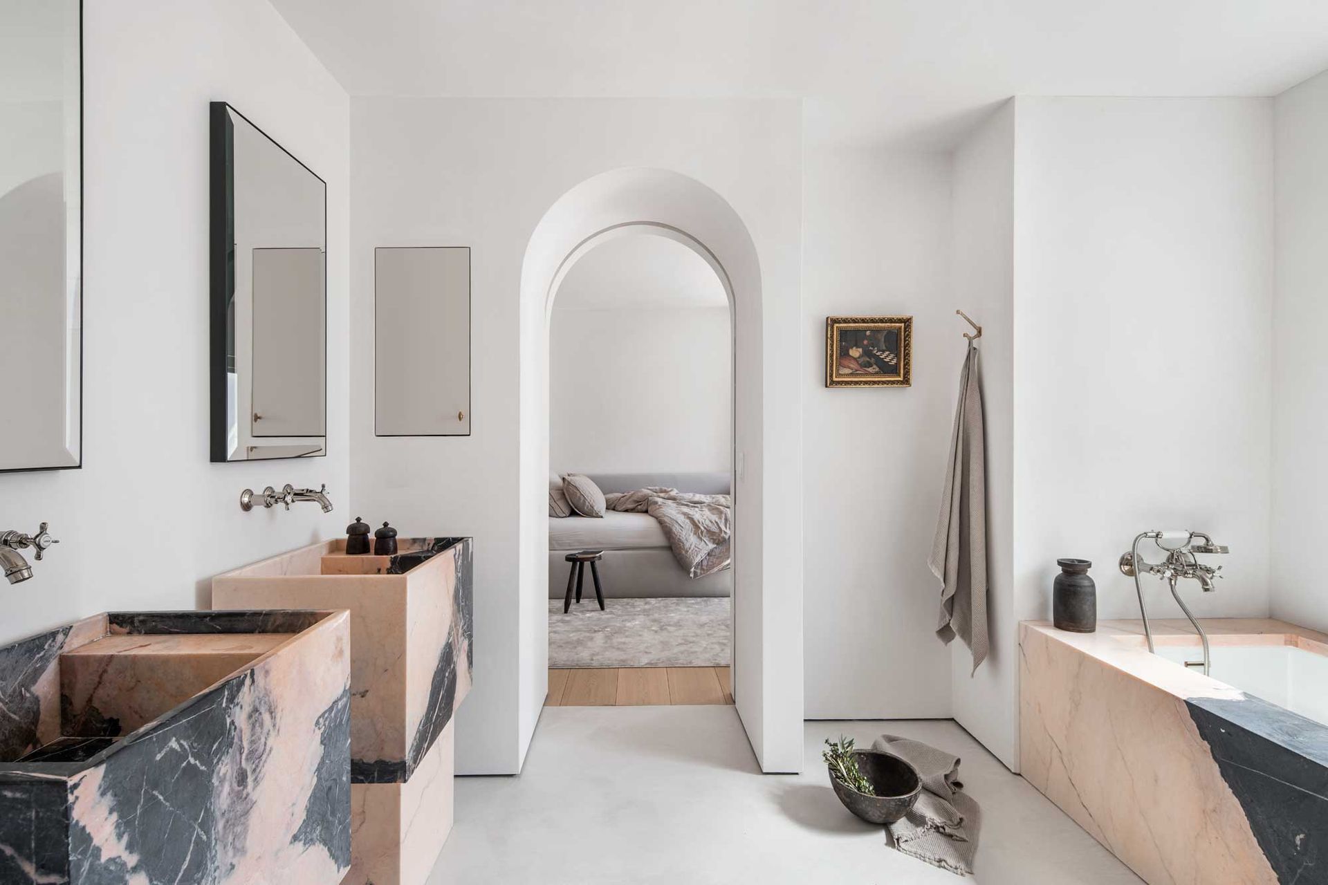
If your complaint of built-in bathtubs is that they don’t feel as luxurious as freestanding baths, the marble bathroom of this beautifully minimalist home in California might cause you to reconsider.
In a muted, white-walled space, a pink-and-black marble has been used for both the freestanding basins and the bathtub. ‘The striking Rosa del Monte marble bath surround was artfully designed in compositions honoring the architectural theme throughout the home,’ explains its designer Mandy Graham (opens in new tab).
8. This sunken soaking tub
(Image credit: Rafael Soldi Photography. Design: Best Practice Architecture)
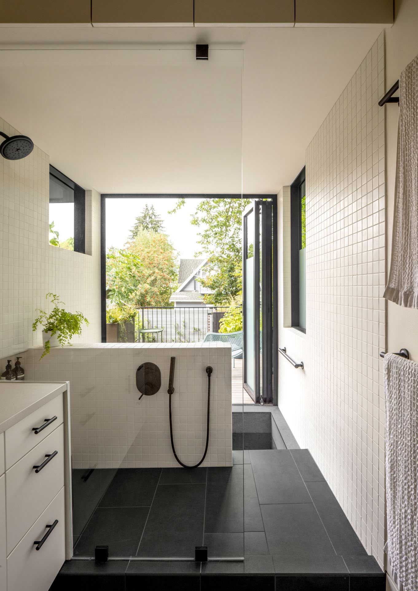
A built-in bath sometimes gives you the opportunity to turn a design element that can be considered mundane into something spectacular – a defining feature for your home. This sunken tub, for example, was incorporated into a remodel of a Seattle home, with bifolding doors that open out onto the deck, creating an indoor-outdoor bathtub.
‘Incorporating the Japanese-style ofuro soaking tub was one of the family’s central objectives to the renovation—it was the one indulgence they afforded as it is central to their family culture,’ explain Ian Butcher, Kailin Gregga, and Kip Katich (opens in new tab), architects from Seattle-based Best Practice Architecture. ‘It was important that the tub have a connection to the landscape with a view and natural light. By placing the soaking tub at the rear of the house, it has become the threshold between the exterior deck and interior while the folding window wall opens up to views of the surrounding cherry and maple trees.’
‘The final design provides a place for a shared family experience whether it is a place to sit on the deck and dip your toes on a warm day, enjoy a hot, relaxing soak with abundant natural light, or bonding time with a family bath,’ the architects add.
9. This industrial yet minimal bathroom scheme
(Image credit: HDP Photography. NC Design & Architecture Ltd)
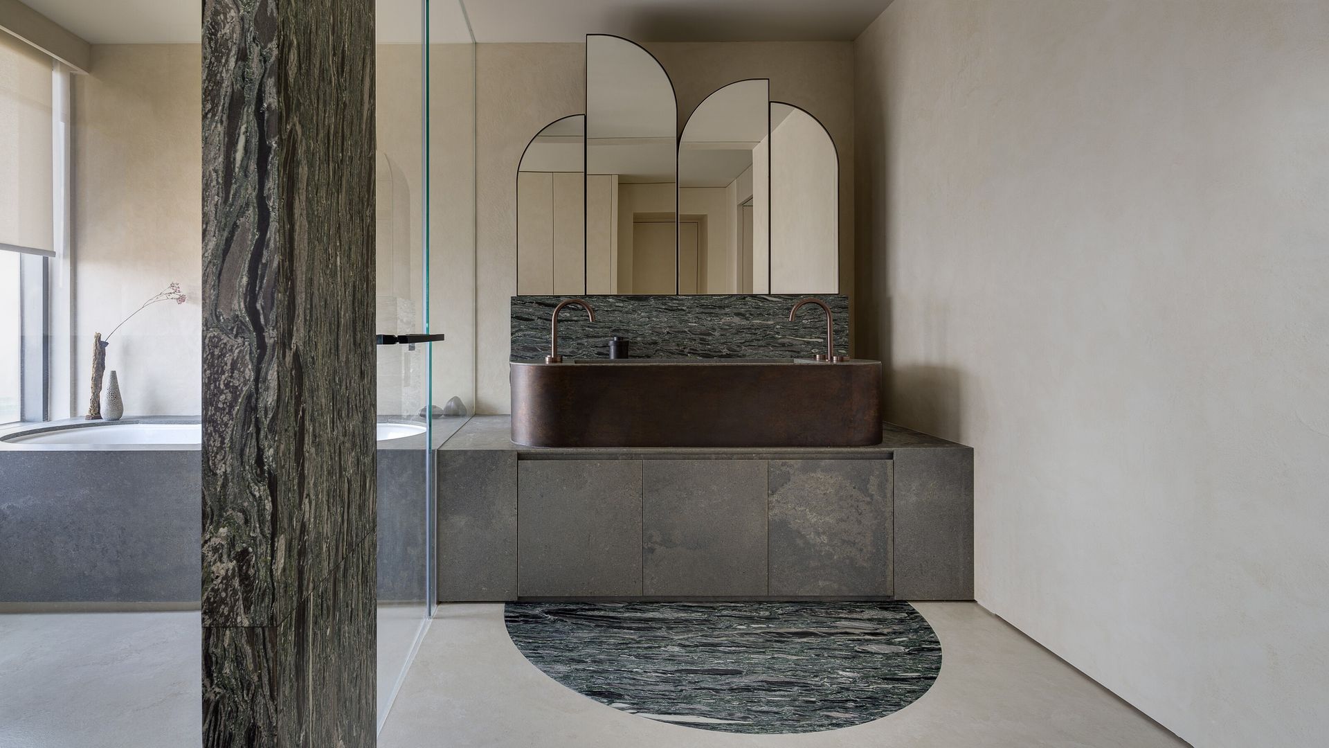
As a way to streamline the design of this bathroom, Nelson Chow (opens in new tab) of NC Design & Architecture introduced one volume of material to house the drop-in bathtub and bathroom vanity. It’s a design that both unifies and simplifies that bathroom.
‘Both a bathtub and elliptical bronze basin have been incorporated into a marble counter,’ Nelson explains, ‘while the glass panel is added to prevent humidity entering the rest of the bathroom as its located adjacent to the closet area.’
10. This stacked bathtub and vanity
(Image credit: Ollie Hammick. Design: Amos Goldreich Archicture )
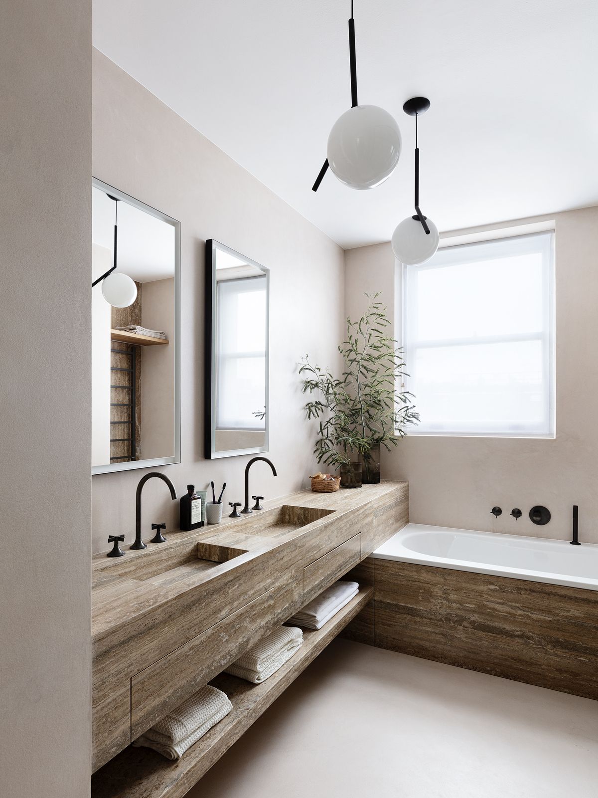
This bathroom layout created by architect Amos Goldreich (opens in new tab) not only creates a beautifully elegant bathroom, but also solves the problem of an otherwise awkward corner created by the positioning of the bathtub and vanity.
By overlaying the vanity on top of the built-in bath, it becomes a single volume, helping the space feel more luxurious and pared back. Both are also finished with the same travertine stone, bringing an opulence to this neutral, minimalist bathroom.

