While it may be one of the smallest spaces in the house, the entryway certainly isn’t the least important, in fact, as the first space guests see on entering, it’s essential it makes a good first impression.
As any interior designer will attest, there’s far more to designing a stylish and functional entryway than meets the eye, and there are plenty of entryway layout mistakes you can fall into.
Whether you’re designing an entryway from scratch or looking to rearrange the furniture in your space, we’ve rounded up some key mistakes people make and have asked the interiors experts for their tips on resolving them.
Entryway layout mistakes
Making entryway layout mistakes can have a big impact on the practicality and look of your space. Whatever the size, to help you get the most out of your space we asked the experts for some tips on how to achieve an organized and uplifting space.
1. Not factoring in enough storage
(Image credit: Richard Powers)
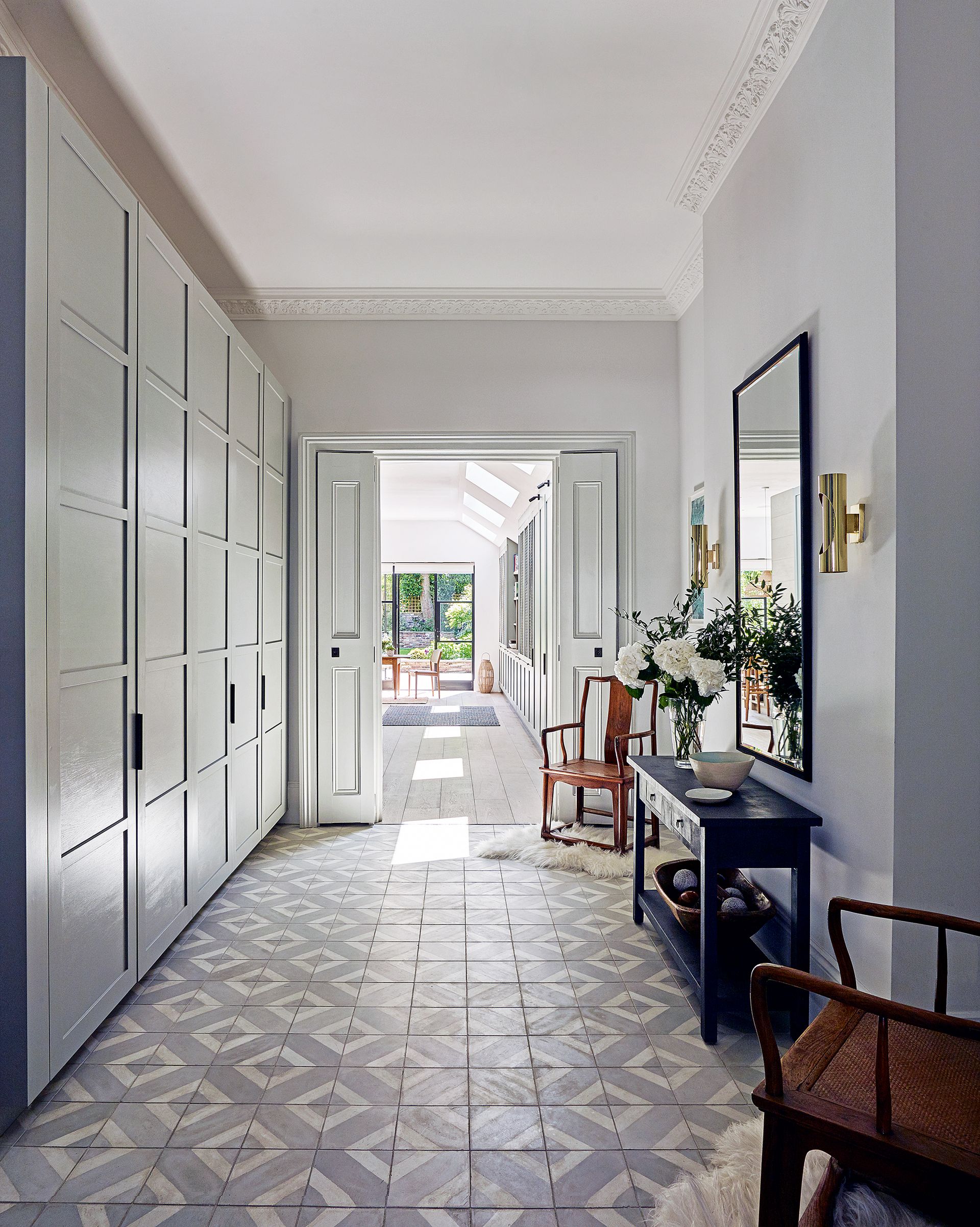
Having a clutter-free entryway is essential for keeping the space bright and welcoming, plus as connecting spaces, it’s important entrances are kept clear. However, without sufficient entryway storage, the floor space can quickly become a dumping ground for bags and shoes.
‘Storage needs should always be the first consideration,’ advises Erin Davis, founder of the virtual interior design studio of Erin Davis Design (opens in new tab). ‘If you have a closet or other built-in storage, that’s great. If not, think about using your vertical space. A tall shelving unit or even a dresser can be a great addition.’
When it comes to organizing an entryway, ‘I’d recommend full-height, built-in storage with seamless closet doors as integral of the millwork,’ suggests Tomoko Hirose, one of Gabellini Sheppard (opens in new tab)‘s senior interior designers. ‘Built-in entryway closets help to maximize storage space while keeping the design clean and minimalist. Coat or shoe storage can be hidden inside for easy access to essentials while reducing clutter. Using subtle groove openings instead of door handles results in a sleek and beautiful look.’
2. Choosing furniture not fit for purpose
(Image credit: Robert Sanderson)
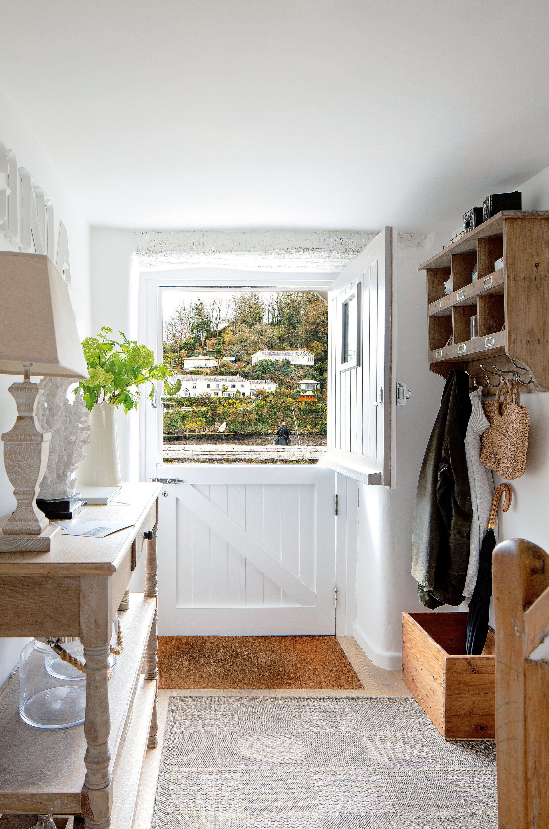
With so many entryway furniture options available, from freestanding pieces to built-in cupboards and wall-mounted solutions like hooks, how do you know which are best suited to your space? Before you invest in furniture be sure to analyze how the space.
‘First figure out how your family functions,’ advises Erin Davis of Erin Davis Design. ‘If they tend to drop and run when they walk in the house then you might opt for baskets or bins. If you have family members who are willing to stop and hang up items, then you can make more use of hooks. Anything that goes against your natural tendencies will be very hard to get everyone to adopt.’
‘I prefer a drop spot right next to the door, with hooks nearby and then a place for shoes and somewhere to sit down a little further from the door itself. It follows the natural rhythm of walking in the door, putting down whatever you’re holding, taking off your coat, and then sitting down to remove your shoes. Setting the space up with this in mind helps to remove bottlenecks at the door when you’re trying to move people through the space,’ adds the interior designer.
‘You also want to think about your patterns or the things you do in order to leave the house. Maybe you always want to check your hair, then add a mirror. If you’re always losing your keys then be sure you have a key rack or bowl by the door.’
3. Filling the space with bulky furniture
(Image credit: California Daydreams)
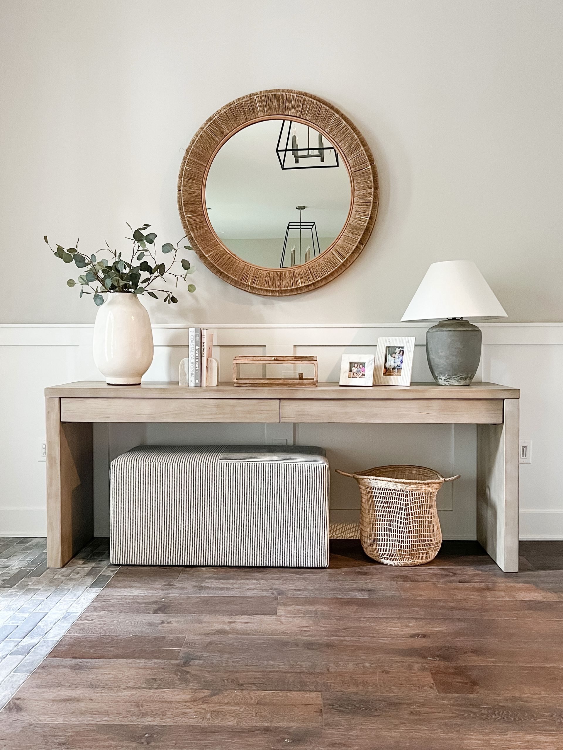
Hallways are often small spaces which can make furnishing them a real challenge. For narrow hallways keep pieces slender and discreet where possible and opt for multifunctional designs wherever possible.
Entryway tables are probably the most popular piece of furniture in a hallway, as they combine storage with display space, but before you go and buy any old piece be sure to take into account the shape and size of your space.
‘When designing an entryway, we’ll usually anchor the space on a piece of furniture – either a console or a bench. I recommend a streamlined piece that isn’t going to be bulky so there’s plenty of room to walk through the space and welcome guests into your home,’ says Gina Caulkins, founder and principal designer at California Daydreams (opens in new tab).

Gina Caulkins is the founder and principal designer at the Marin County interior design studio California Daydreams. Heavily inspired by coastal style and the natural world, she specializes in creating practical yet serene family spaces that are bright and full of texture.
4. Choosing the wrong shape of entryway table
(Image credit: Future)
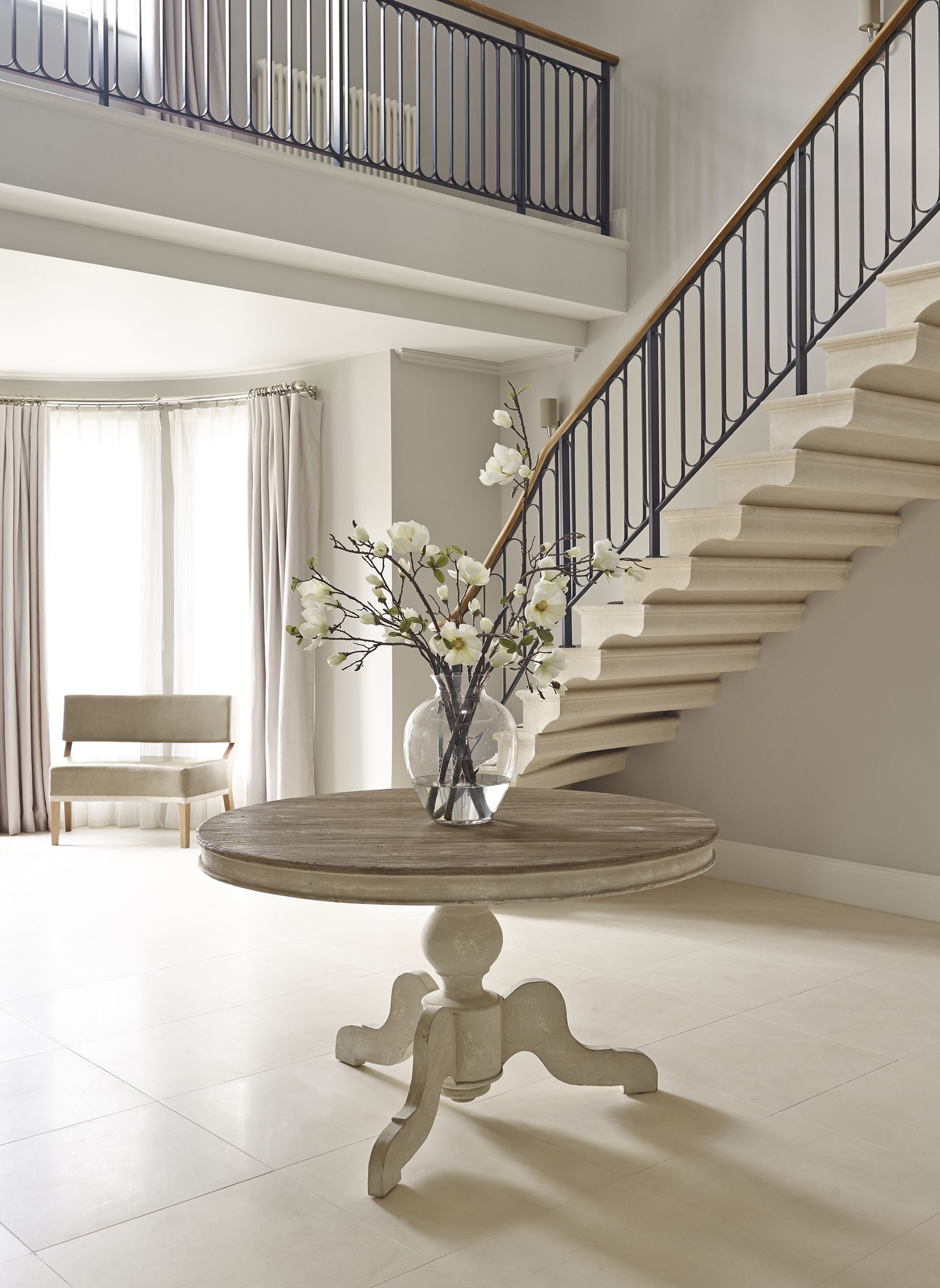
As well as the size of the entry table it’s also important to make sure the entry table you choose suits the shape of the space, highlights Tomoko Hirose, of Gabellini Sheppard (opens in new tab).
‘If you have limited space to play with, try positioning an entryway table flush against the side wall to use as storage for keys and other functional necessities. If working with a spacious and round entry vestibule, try placing an entryway table in the middle of the room as a featured element.’
5. Obstructing the flow of traffic
(Image credit: Davide Lovatti / Future)
‘A common mistake people make when laying out an entryway is not taking into consideration the flow of traffic,’ says interior designer Nina Magon (opens in new tab). ‘The entryway should be designed to create an inviting atmosphere, while also allowing for an easy transition from the outside world.’
‘Depending on the size of the space, you may want to avoid large pieces of furniture such as armoires, dressers, and bookcases, as they can take up a lot of space and make the entryway seem cramped,’ adds Nina.
‘If you are working with a narrow entryway it’s important to incorporate furniture pieces that do not disrupt the flow of the space. For instance, your console table should be somewhat slender so that it creates a beautiful vignette in the space that adds interest to the design in a functional manner,’ adds interior designer Jennifer Hunter. (opens in new tab)
As well as buying the right size and type of furniture for your storage needs it’s also important to place furniture such as entry tables on the right so that the walkways are not obstructed, after all, entryways are connecting spaces.
‘You want to be sure the table isn’t going to be a hindrance as you’re navigating the space but you also want it convenient for dropping mail, keys, etc,’ adds interior designer Erin Davis. ‘If possible I like to put it within a few feet of the door with a chair or bench next to it so you have somewhere to perch while putting on or taking off shoes.’
6. Not making use of alcoves
(Image credit: Future)
In entryways, space is often at a premium, so it’s important to think about maximizing every inch of space and alcoves are a wonderful opportunity to do this.
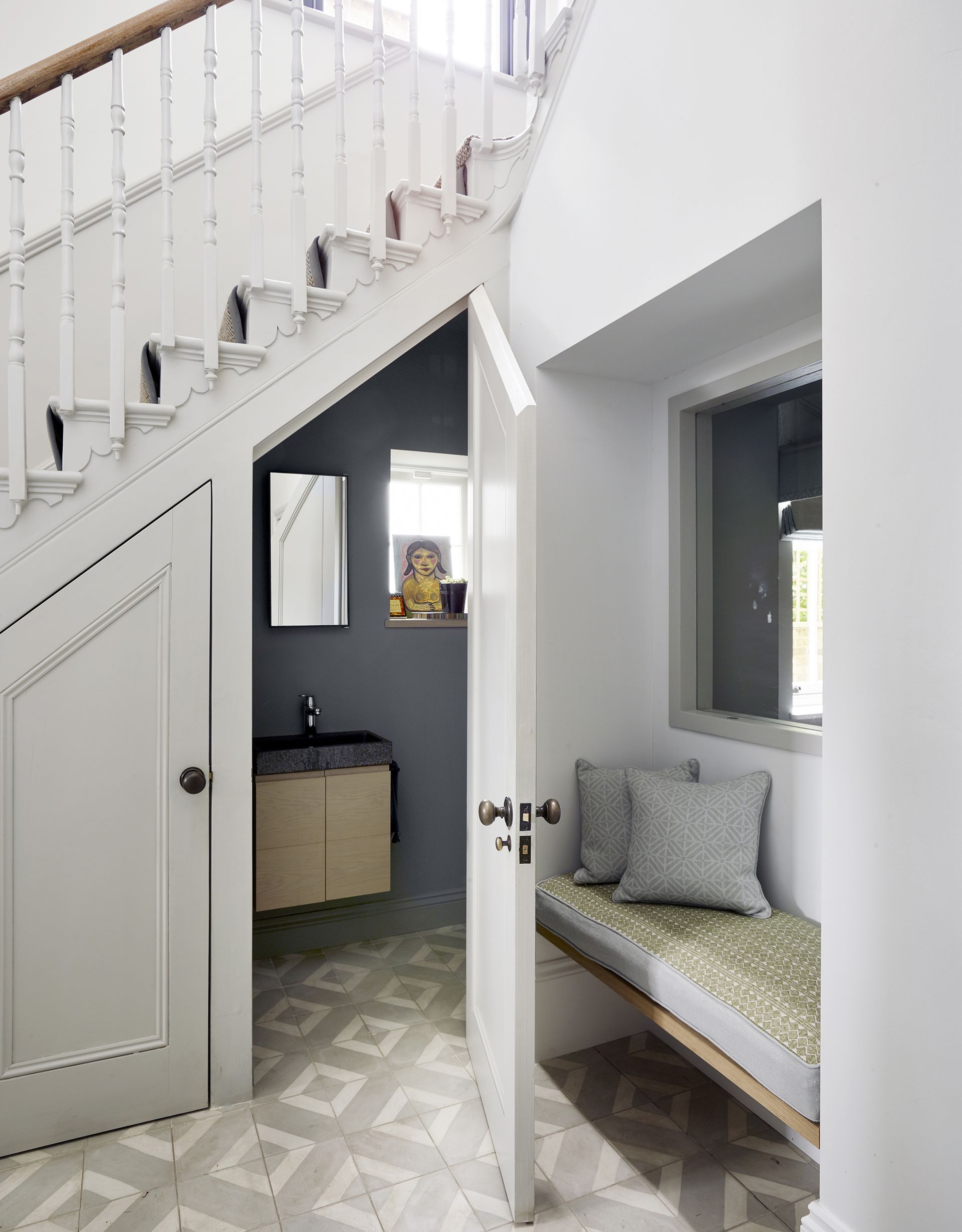
‘A specialist fitted furniture supplier will be able to take full advantage of connecting spaces by maximizing on and cleverly utilizing alcoves and sloping roofs,’ says Jamie Godfrey, senior designer at Neville Johnson (opens in new tab).
‘Often, a simple piece of furniture such as a bookshelf or display wall can fit perfectly into these spaces. If a customer has alcoves and wide entrances, these are often a ‘by-product’ of a renovation and should be viewed as storage opportunities rather than awkward spaces that cannot be used. With good quality fitted storage, a large landing area can essentially be transformed into an extra room, such as a home office with hidden desk space and built-in bookshelves and filing. A statement library wall can also be incorporated into this space.’
7. Obstructing windows
(Image credit: Mylands)
Light is often at a premium in an entryway, so if you’re lucky enough to have large windows, be sure not to obstruct them with bulky pieces of furniture.
In this modern entryway, the combination of light Charterhouse paint by Mylands (opens in new tab) on the walls and discreet furniture on the legs helps to maintain a bright and airy feel.
8. Choosing the wrong rug
(Image credit: Paul Massey)
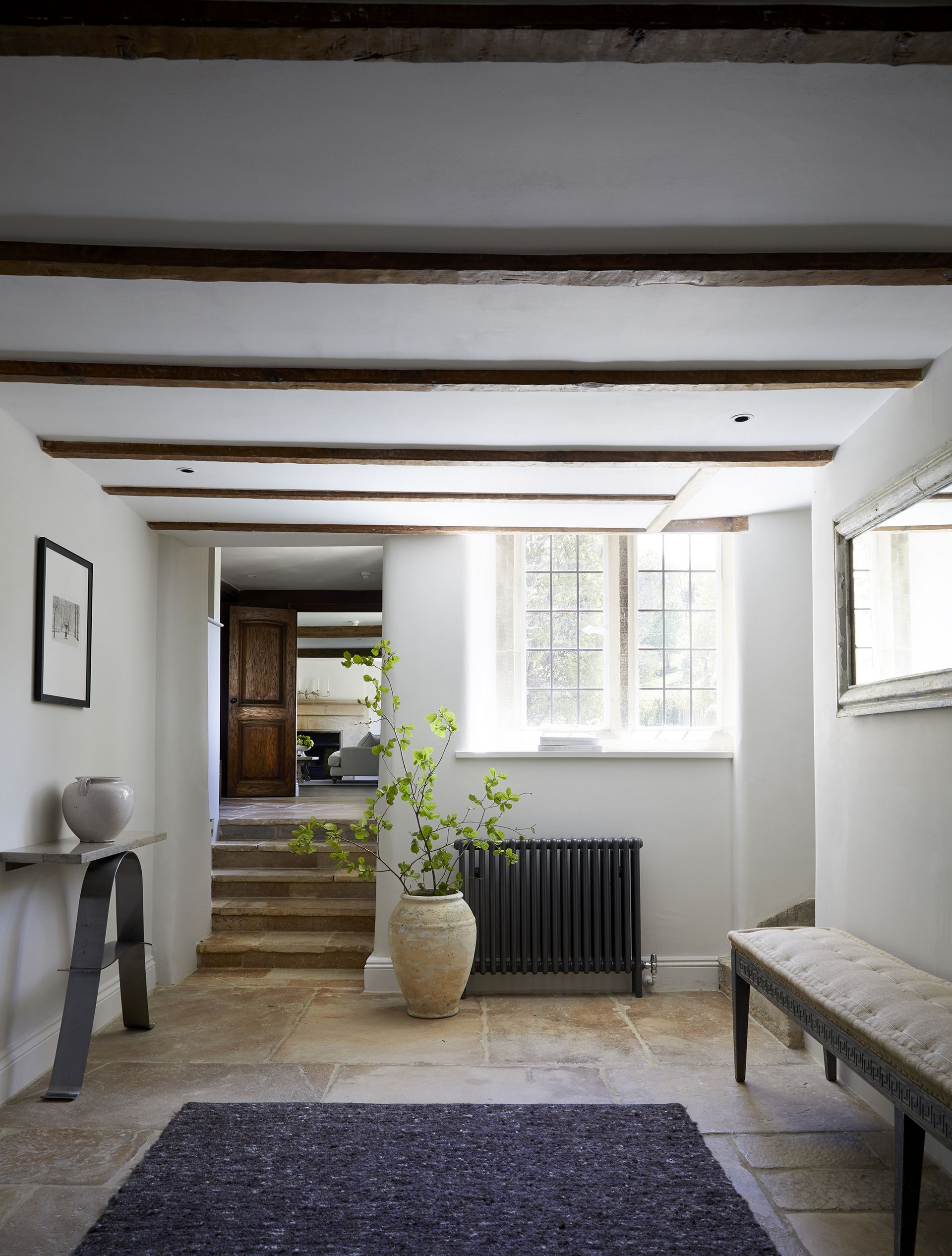
If you have a hard entryway floor then factoring in a hallway runner or rug is a wonderful way to bring warmth, texture and interest, plus will help deaden sounds, too, but make sure you get the sizing right.
‘Homeowners commonly use too small of entry rugs, leaving the rest of the foyer looking awkward and bare,’ says Molly Cody, founder of Cody Residential (opens in new tab). ‘Don’t just look for a rug to wipe your feet but one that will take up a sizable amount of space.’
9. Not making the most of the wall space
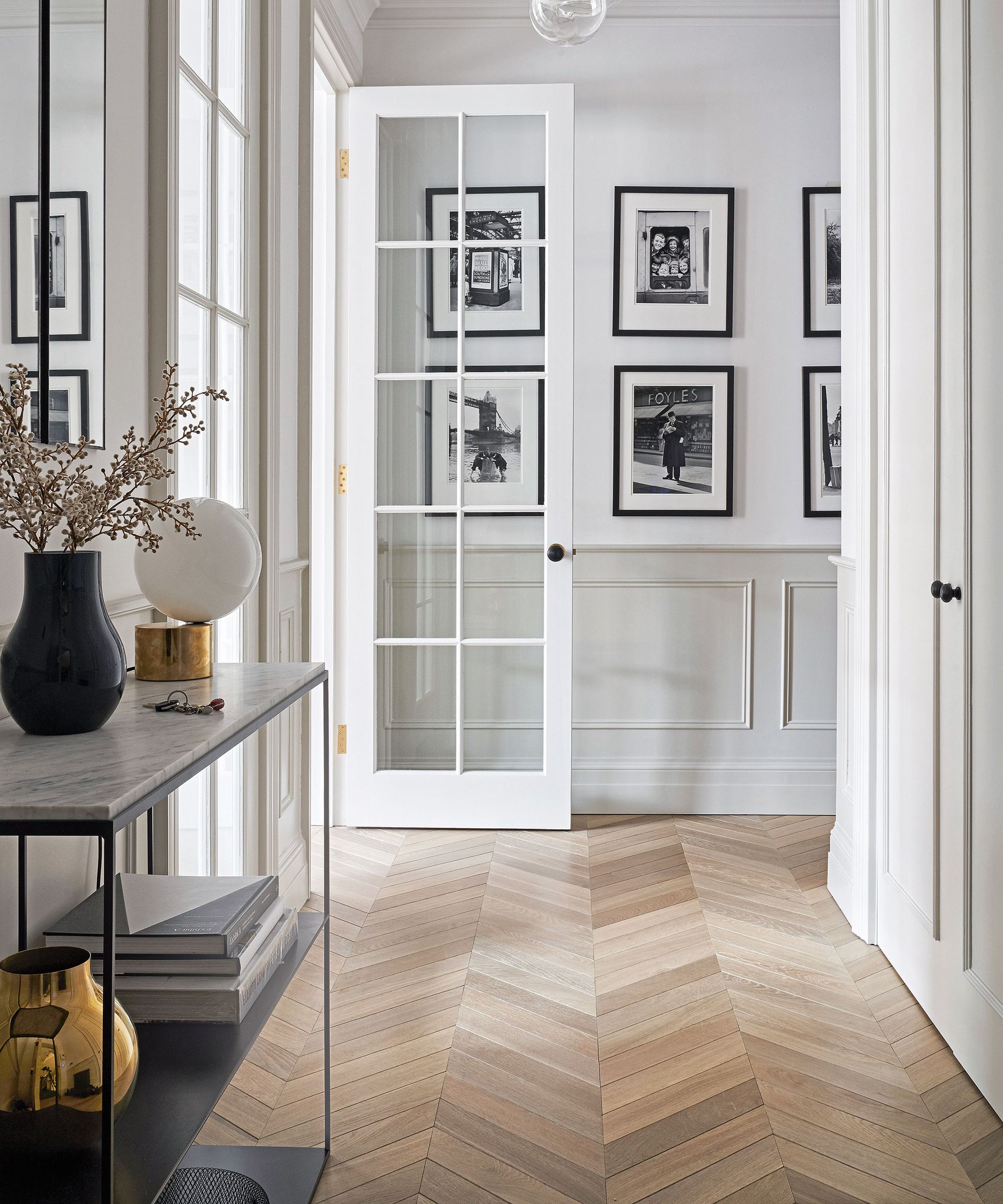
As small spaces we just pass through entryways can easily be forgotten when it comes to decor, but as the first spaces guests see on entering your home, they make wonderful spaces to showcase your personal style. When it comes to entryway wall decor ideas there are so many options – hallways make perfect spaces for decorating with art or decorative objects, alternatively, you could hang a hallway mirror to help create the illusion of space.
‘Hallways are a great space to add art pieces. They are spaces for transit and they have lots of free space for flow so in them you can add several pieces that together tell a story, or a single striking piece either on the wall or as a sculpture that creates a visual focal point,’ suggests Katrien Van Der Schueren, the founder of Voila! Creative Studio (opens in new tab), is an LA-based visual arts studio. ‘A collection of beautifully framed photographs, a well-lit sculpture, a massive custom painting, or a plaster mural like the ones we make at Voila! are pieces that turn your head and balance the usually fast pace one has when walking through a hallway.’
‘Mirrors in entries are practically essential, and not just because of the beautiful quality they create, but also because they are convenient for one’s appearance upon entering or leaving for the day,’ adds interior designer Jan showers (opens in new tab).
‘It’s wonderful to walk into a house and discover right away an unexpected painting, sculpture, or photograph. Great art generates excitement and makes all who enter interested to see what lies beyond. These pieces are essential when designing an entry!’
How do you create a functional entryway?
The key to creating a functional entryway is to plan carefully. ‘To get started, you should begin by assessing the space that you have available and consider the size and shape of the entryway. Additionally, consider the purpose of the space and the items that you would like to include,’ explains Nina interior designer Nina Magon (opens in new tab).
‘Think about furniture, lighting, and storage needs. Once you have identified what you need, you can begin to draw up a plan for the entryway layout. Make sure to leave plenty of room for movement, and consider the aesthetics of the space.’
When it comes to creating a functional entryway layout many interior designers agree that having sufficient storage is essential. ‘Start your layout with storage, then have fun with style,’ says Brooklyn Daugherty, a registered architect and an interior designer of Cult Creative (opens in new tab). ‘Create a place for everything, and then leave yourself even a bit more room where you can for those little pieces you’ll forget. Stash your shoes on a lift-up bench. Hats and gloves can hide in bins on an upper shelf, while coats can be in a nearby closet, leaving hooks clear for visitors to use. Don’t forget an umbrella stand if your neck of the woods regularly gets a little rainy.’
While practicality is important, she stresses this needs balancing with aesthetics.
‘While we want the entryway to function, its primary purpose is to act as a special welcome to our home – keep that in mind as you look for styles, colors, and materials to incorporate in its design.’

