Creating balance in interior design is crucial for a harmonious scheme, as it will ensure that a room feels relaxing, grounding and comfortable.
One of the most important interior design rules to follow, balance focuses on distributing the right visual weight around a room to establish a sense of stability, and this can be achieved through everything from paint colors and lighting to furniture placement, texture and more.
Just like using repetition, rhythm, symmetry and emphasis in interior design, creating balance will only help to make a room feel more inviting and look more visually appealing and beautiful.
What is balance in interior design?
‘The idea of balance in interior design is completely in the eye of the beholder,’ explains New York City-based interior designer, Phillip Thomas (opens in new tab).
‘It is one of the most important concepts in all of my projects and has been learned along the design journey with each of my clients. It can look different in every project – sometimes balance is more literal and means symmetry and placement of furniture and objects or art. Sometimes a balance can mean embracing asymmetry and creating a pleasing space with similar sizes or shapes, as opposed to exact mirroring. Other times balance can translate to color, light and layers.’

Phillip Thomas
NYC-based interior designer Phillip Thomas (opens in new tab) is a graduate of the New York School of Interior Design where he received his Bachelors in Fine Arts. Before he started his own firm in 2011, Thomas worked for New York interior design firm, Ingrao Inc (opens in new tab).
How to create balance in interior design
‘Balance can be achieved symmetrically or asymmetrically. Symmetrical balance lends itself to a more formal and ordered look, while asymmetrical balance creates a looser more eclectic feel,’ says Cathrine Dal, from London-based design studio, Cat Dal interiors (opens in new tab).
From your color scheme to where you position your furniture, there are many factors to consider when creating an element of balance in a room. So, with the advice from a whole host of interior design experts, let us take you through the 7 foundations of creating balance in interior design.

Cathrine Dal
Copenhagen born, Cathrine Dal, is the founder of London-based interior design studio, Cat Dal Interiors (opens in new tab), who have a design ethos rooted in Scandinavian design.
1. Embrace the rules of symmetry
(Image credit: SHH)
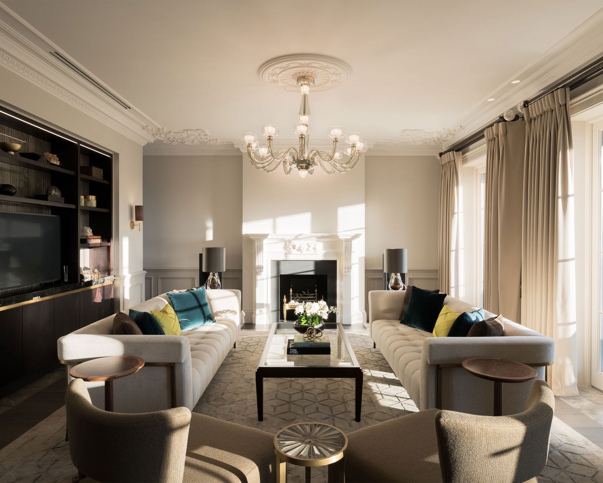
‘Balance in an interior is important as it creates the basic flow of the room and a feeling of stability and harmony. Balance can easily be achieved by ensuring symmetry within the interior and mirroring finishes,’ says Bethany Prince, associate interior designer at London-based interior design practice, SHH (opens in new tab).
Styling with symmetry is key for creating balance and good feng shui in the home, as it can help to make a room feel more neat, organized and cohesive.
As shown above, this living room designed by SHH embraces the rules of symmetry to create a beautifully balanced design. The coordinating sofas, armchairs, tables and lamps have been styled symmetrically around the coffee table and fireplace, establishing a unified and elegant design that feels crisp and clean.

Bethany Prince
Bethany Prince has worked at London-based interior design practice, SHH for the last four years. Now an associate interior designer, Prince has past experience at March & White (opens in new tab) and OSG Architecture (opens in new tab).
2. Do not be afraid to create contrast
(Image credit: Field Theory)
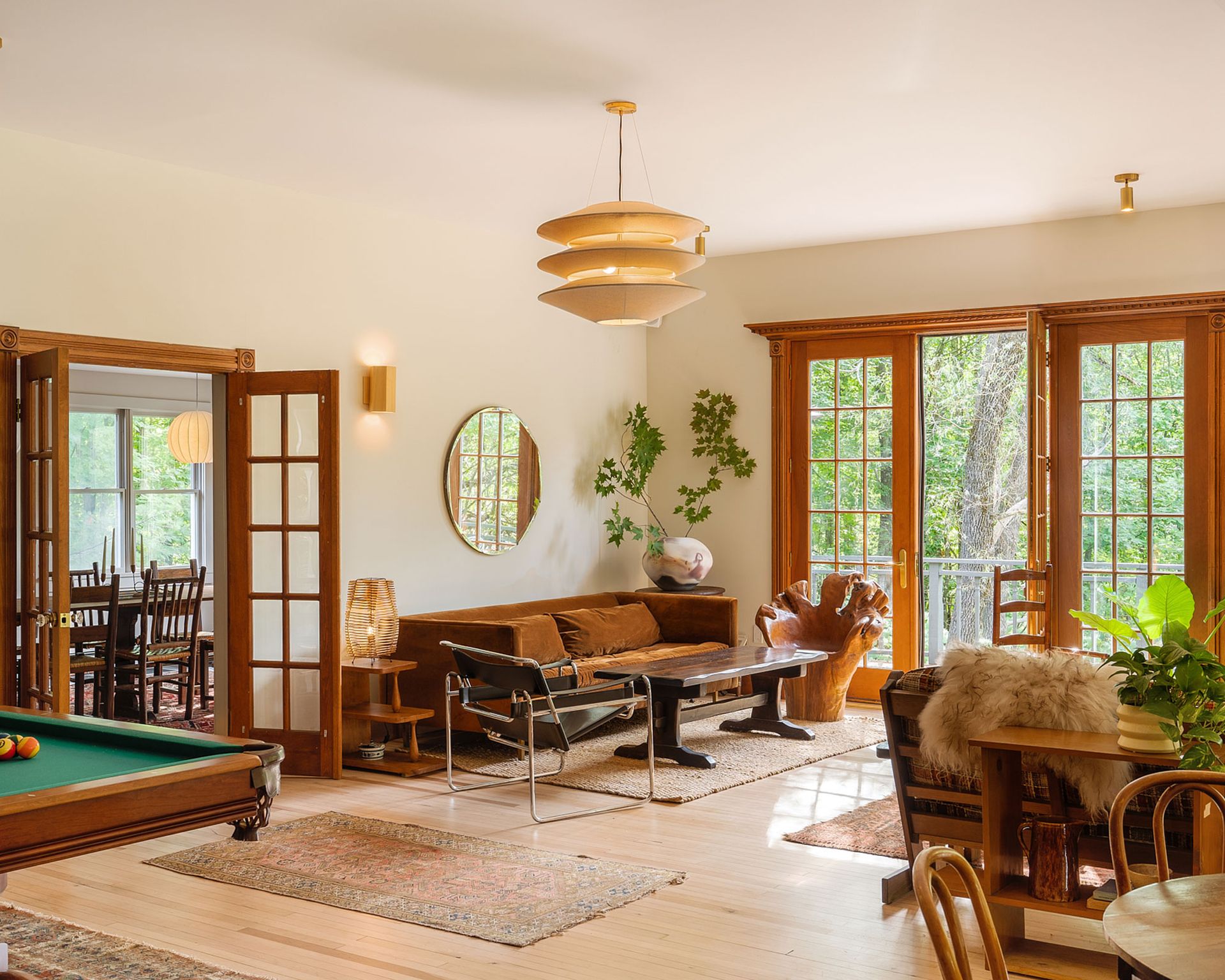
However, a symmetrical space is not for everyone, so you’ll be glad to know that balance can also be created through an asymmetrical design and using elements of contrast – ideal if your style is more relaxed and eclectic.
San Franciso-based interior designer, Leah Harmatz of Field Theory Design (opens in new tab) says, ‘for me, finding balance in space is all about exploring the juxtapositions in design; whether it’s materials, shapes, or eras. A room feels balanced when there is just the right mix of vintage and modern, dark and light, linear and curved, hard and soft – the contrasts are limitless.
Too much of one element and the room feels boring and one-note, or off-balance. When you achieve an equilibrium, there is a feeling of calm and also a slight intrigue and individuality to the space.
Above, we renovated this 1890s building with the goal of preserving many of the gorgeous original architectural details, while layering in some modern, minimalist furniture and art to add that sense of balance and contrast.’

Leah Harmatz
Leah Harmatz founded the San-Francisco-based design firm, Field Theory (opens in new tab), in 2015. Field Theory studio is a collaboration between Harmatz and Mike Rosenzweig, with an aesthetic influenced by travel, architecture, handcrafted furniture, and antique finds.
3. Or, turn to radial symmetry
(Image credit: Jon Day Photography)
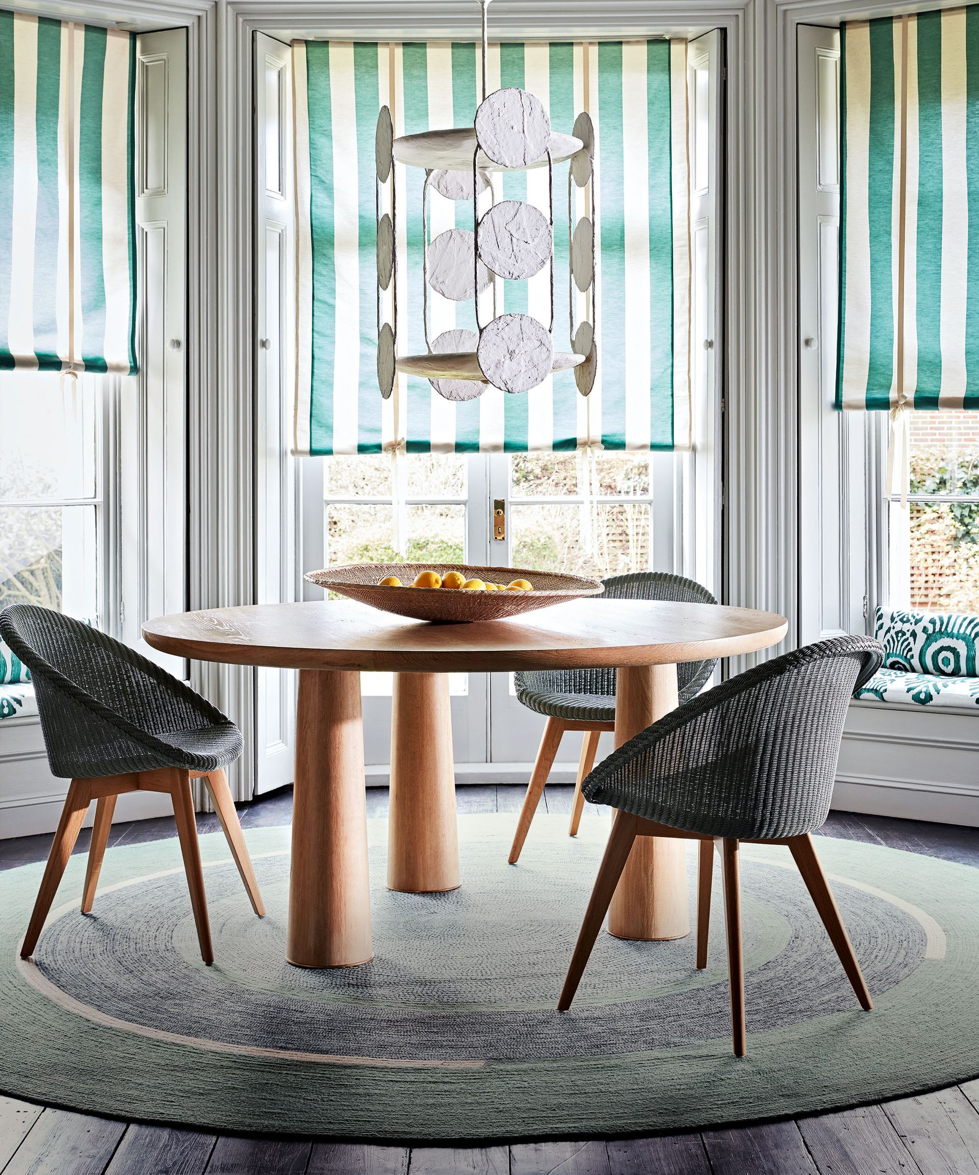
Radial symmetry in interior design focuses on starting a design in the center of the room and working outwards into the space by using circular forms. This achieves a sense of balance and provides a central focal point in which we are drawn when we step foot into the space.
Radial symmetry is perfect for use in a dining room, for example, a round dining table can be placed in the center of the space, and further enhanced by the use of a round light fixture and circular rug, as shown beautifully above.
The soft and soothing shape of a circle is renowned to make us feel more calm and more relaxed when used in interior design, and designing a room with radial symmetry in mind can also help to make a space feel more sociable and intimate.
4. Use the 60-30-10 rule to balance color
(Image credit: Mary Wadsworth)
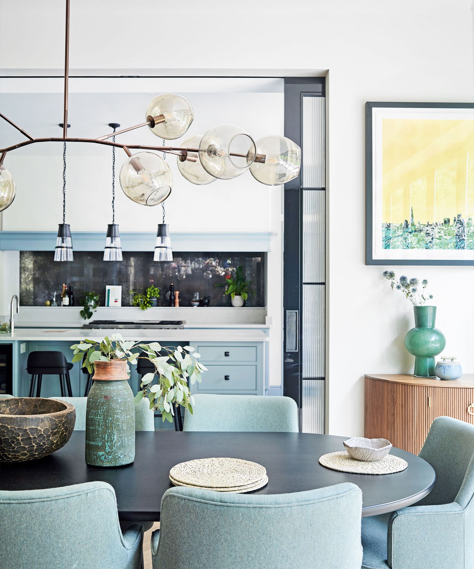
‘The 60-30-10 rule is a great guide to ensure balance. Think about using the main color (60{171d91e9a1d50446856093950b947460c67b1ae5766d3d173ffede4594e3fbfb} of the space) on the walls or large furniture. 30{171d91e9a1d50446856093950b947460c67b1ae5766d3d173ffede4594e3fbfb} will be your accent features such as rugs, bedding, chairs, and curtains, and 10{171d91e9a1d50446856093950b947460c67b1ae5766d3d173ffede4594e3fbfb} is the art, accessories and cushions you display,’ says Emma Bestley, creative director and co-founder of YesColours (opens in new tab).
You can also follow the 80-20 color rule. This is where 80{171d91e9a1d50446856093950b947460c67b1ae5766d3d173ffede4594e3fbfb} of the space is decorated in neutral colors, such as white, beige, or pale pastels, creating a calming foundation, with the remaining 20{171d91e9a1d50446856093950b947460c67b1ae5766d3d173ffede4594e3fbfb} used to create beautiful elements of contrast through brighter accent colors.

Emma Bestley
UK-based homegrown paint brand, YesColors, was founded by friends, John Stubbs and Emma Bestley. Alongside being a painter and color expert, Emma has worked in museums, fashion buying and events within the media industry.
5. Create different levels
(Image credit: Ruth Maria Murphy)
Using furniture, lighting and accessories in all different kinds of shapes, sizes and heights will create a space with multiple levels, helping to evenly distribute visual weight around the room, and therefore, creating balance.
From styling a shelf with objects in different sizes to placing a tall floor lamp beside a sofa or armchair, decorating a space with objects in various heights will visually elevate a room, transforming it from flat to full of balanced visual interest.
6. Avoid creating ‘dead spaces’
(Image credit: Bradley Odom Design)
‘Balance is achieved through scale, symmetry and both the proportion of the pieces in a room and the room itself,’ explains Atlanta-based interior designer, Bradley Odom (opens in new tab).
‘To achieve a great balance, you must consider the visual weight of each piece, whether that be a sofa or a patterned wallpaper, and offset that with pieces that provide a beautiful counterpoint. Visual weight should be dispersed evenly throughout the space – and ceiling – to create a great sense of intentioned design.’
To avoid dead spaces – or ghostly “dance floors” as I call them – that throw off the balance of a room, we’ll often add another thoughtful seating arrangement or allow the space to become more reflective through a pedestal and an amazing piece of art.’

Bradley Odom
Atlanta-based interior designer Bradley Odom (opens in new tab) grew up in Mississippi and studied at the prestigious, Savannah College of Art and Design. Odom’s work is heavily influenced by the rich heritage of the South.
7. Pause and take a step back
(Image credit: Urbanology Designs / Photograph Matti Gresham)
‘Personally, creating balance in interior design is about following my gut, trial and error, and being patient to see how a room settles into itself over time.
Seeing a space at different times of the day and even seasonally, has a huge impact on me seeing its balance,’ says Louise Roe, founder of Sharland England (opens in new tab).
Creating balance isn’t something that necessarily can happen instantly – especially if you have just moved somewhere new. It can take time to work out what a room needs in order for it to feel more harmonious – as after all, we all have different homes and styles, and balance can be just as much a feeling as it is a look.
From choosing the right lighting to picking the perfect color palette and room layout, sometimes gradual changes over time can create the best, balanced results.

Louise Roe
Journalist, blogger and founder of homewares brand, Sharland England, London-based Louise Roe (opens in new tab) has worked across titles such as Vogue, Elle UK, In Style UK and Luxdeco Interiors magazine.
FAQs
Why is balance in interior design important?
Interior designer Jen Dallas (opens in new tab) says, ‘balance is important to keep a room feeling harmonized whether it be the color or materials selected or the arrangement of furniture.
‘Balance makes sure not one element in the room overpowers another. It keeps your eye appreciation of the overall look and feel of the room and is not focused on only one thing.
‘Balance is something we notice the right way. We know when space doesn’t feel good. It could be because all of the furniture is on one side of the room and not placed correctly. It could be because there is a piece of art that is too small for a wall or the color palette of the room doesn’t make sense.
Balance is important to create cohesiveness within the room.’

Jen Dallas
Jen Dallas (opens in new tab) is a California based interior designer, whose studio has its very own line of textiles tiles, rugs and lighting.
How do you balance tone in a room?
‘Look at color families that sit happily together – nothing that shouts against other elements in a room – this doesn’t necessarily mean a timid choice of palette, you can go as bold or as dark as one desire but just consider the interaction between all the elements in your space from chosen paint colors, fabrics used, positioning of furniture even down to details how your pictures are hung,’ says Patrick O’Donnell, color consultant and brand ambassador from Farrow & Ball (opens in new tab).
Ruth Mottershead, director at Little Greene (opens in new tab) also explains, ‘when looking to create a cohesive feel within your home, it’s key to consider how the various elements will come together to ensure a sense of flow and connection. For a gentle and considered feel, opt for tonal colors such as those within our color scales palette, a collection of colors that offer different strengths of the same pigment. These will combine with ease and are based on the same undertones for a space that is harmonious and relaxing.’

Patrick O’Donnell
Patrick O’Donnell is Farrow & Ball’s Color Consultant & Brand Ambassador and has been with the brand since 2021. Patrick works with designers in the UK and North America, helping to bring their projects alive with the iconic, F&B color palette.

Ruth Mottershead
Ruth Mottershead is the creative director of the family-run paint and wallpaper businesses Little Greene and Paint & Paper Library, which specialize in creating luxurious paint and wallpaper that represent 300 years of decorative history.

