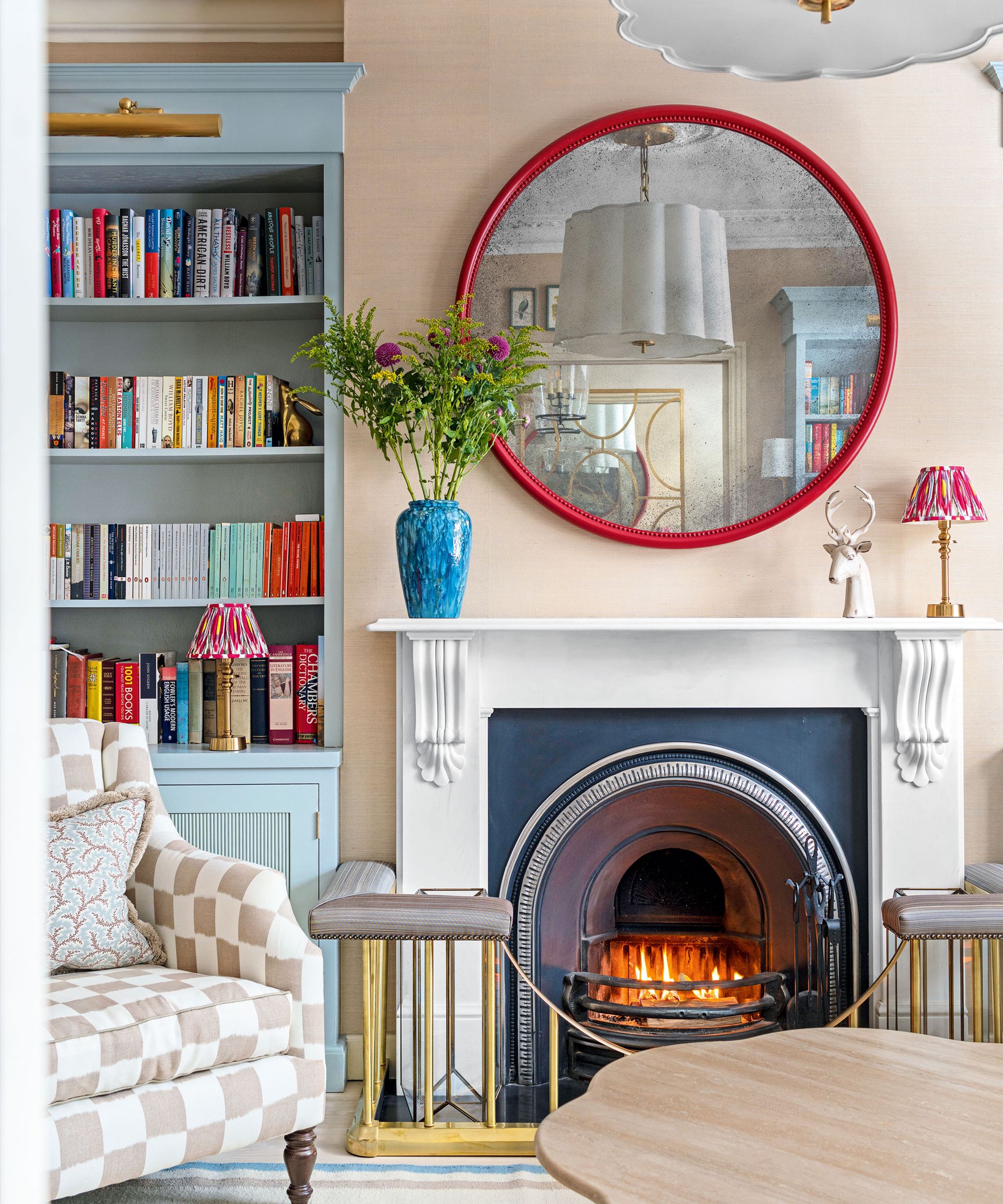
Rules, rules, and more rules, whether you love them or hate them, interior design rules can provide expert guidance and advice to follow when designing and styling a home.
However, with so many rules to navigate and interior design tips to explore, it can sometimes be tricky to work out exactly what rules are applicable to your space, as after all, everyone’s home and taste are completely different.
I currently live in a small apartment and have had to think carefully about how I can make the most out of the small space, so I thought I would share with you the top six interior design rules that I swear by in my own home; from everything to room color, apartment layouts, styling and more.
The 6 interior design rules that have shaped how I have designed my home
Whether you have moved into a new home and are in need of some layout and styling inspiration, or want to make a few changes in a small room as something just doesn’t feel quite right, explore the interior design rules I swear by to help you create the perfect design scheme.
1. No living room furniture against the wall
(Image credit: James Merrell)
My apartment comprises two bedrooms, a bathroom, an entryway, and one central, open-plan space that houses a kitchen, living room, and dining area.
This main room has to work hard, it is where I cook, eat, relax, and entertain with friends and family, so in order to create distinct, separate areas in the room, I had to cleverly zone the space. A ‘zone’ can be created through everything from paint, rugs, furniture and more, and in my apartment, I wanted to create two separate zones for dining and relaxing.
In order to do this, instead of pushing all of my living room furniture against the walls, I brought it together instead, creating a cozy and more intimate seat space that gathers around the TV and fireplace. This not only created a room within a room effect, but it also left more than enough space to then bring in a dining table and establish a separate dining zone, too.
Artem Kropovinsky, interior designer and founder of Arsight (opens in new tab) supports this and says, ‘placing furniture away from the walls is a popular design principle that helps to create a more inviting and cozy atmosphere by encouraging interaction and relaxation. It can also help to define spaces within a larger room, and make it feel less like a traditional living room.’
Bringing furniture away from the walls is often used in larger spaces, helping them feel close and cozy, however, it has worked just as well in my small space, and shows that zoning is not just reserved for bigger, expansive environments.
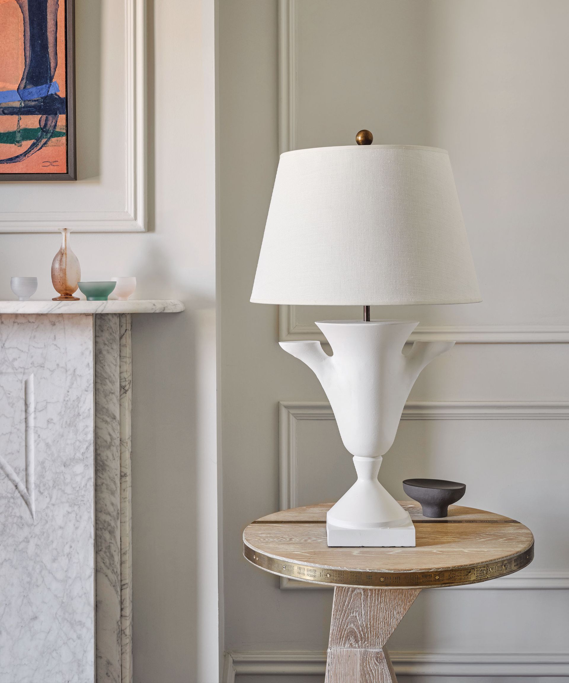
2. Layered lighting
(Image credit: Simon Bevan)
Autumn and Marcus Mohon of Mohon Interiors (opens in new tab) say; ‘a careful curation of layered lighting is the key when creating a dynamic and functional living space. We like to incorporate a variety of light sources, from overhead fixtures to lamps at eye level and even floor lighting, illuminating sheer panels or walls to add an extra layer of mood and ambiance. To truly elevate the design, it is essential to have lighting that is not only adjustable in height but also adaptable for various tasks.’
If, like me, you hardly ever use the ‘big light’ in your home, then creating a layered lighting scheme is essential.
This rule can sometimes be broken in more practical areas of the home such as a kitchen or bathroom, but more often than not, having more than one light source in a space is key. From cozy table lamps in my bedroom to a floor lamp positioned beside the sofa in the living room, these welcoming pools of light help to make my space feel more inviting, warm, and relaxing.
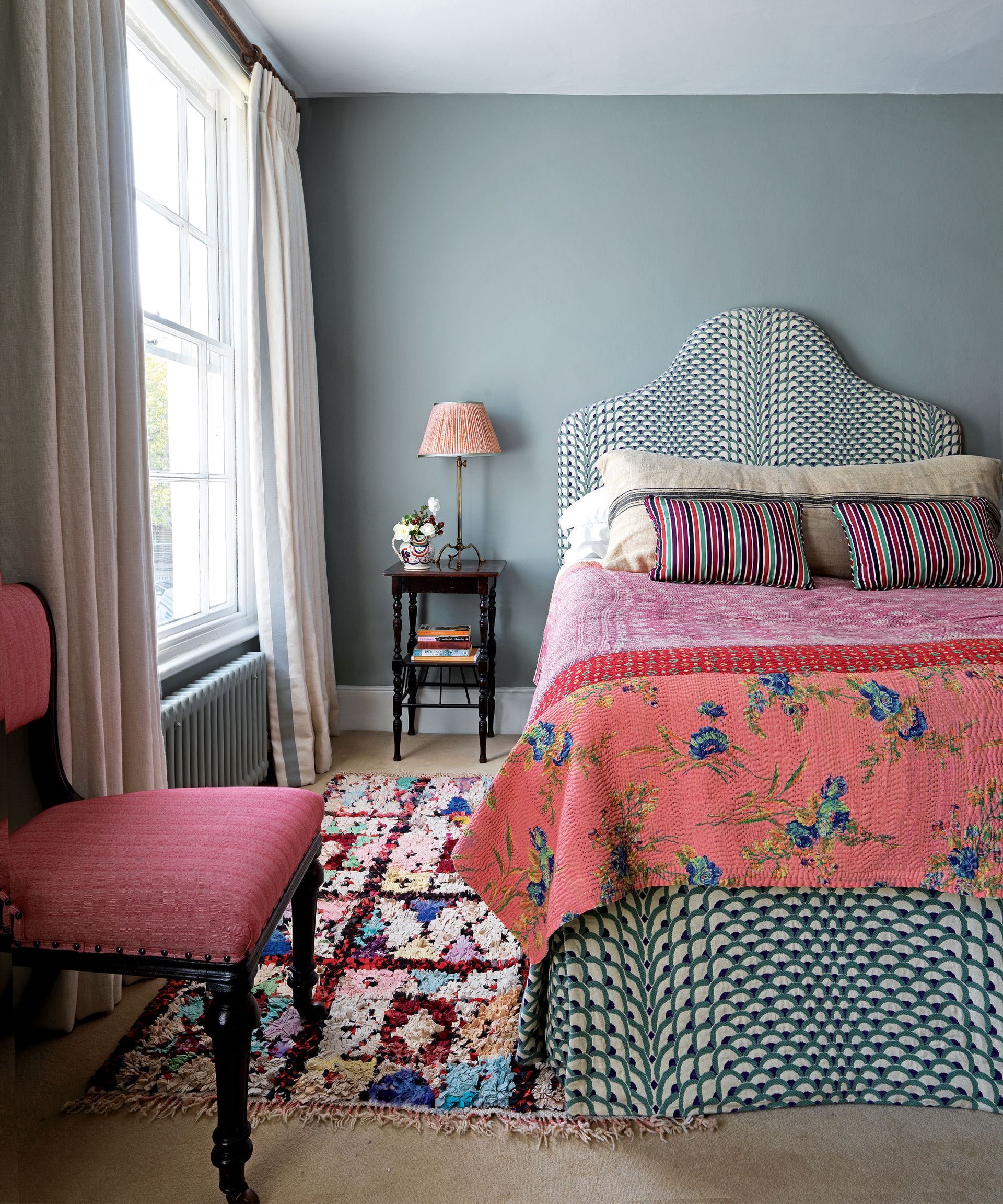
3. A mix of patterns
(Image credit: Future)
I’m a big lover of color and pattern, and maximalist decor is definitely more my style over minimalism, however, using a mix of contrasting patterns and prints does not always have to be big and bold, it can be both impactful and subtle, and is key for bringing beautiful visual interest and personality into a room.
Daniela Boleto, design director at Camomile London (opens in new tab) says, ‘combining a selection of prints and toning colors not only creates a beautiful depth and texture but allows a truly personal stamp on the home. Expressing yourself through mixing and matching fabrics and accessories is a lovely way to add character to a room and can evolve over the years as you find more favorite pieces.’
From stripes to checks, florals to botanical, more is always more in my book when decorating with pattern, but no matter your taste, and whether you introduce pattern through wallpaper ideas, upholstery, bedding, or rugs, it can be a great way to showcase your design style.
For further inspiration, explore how to mix patterns and prints in interior design with guidance from fabric and wallpaper designers, Penny Morrison (opens in new tab) and Charlotte Gaisford (opens in new tab).
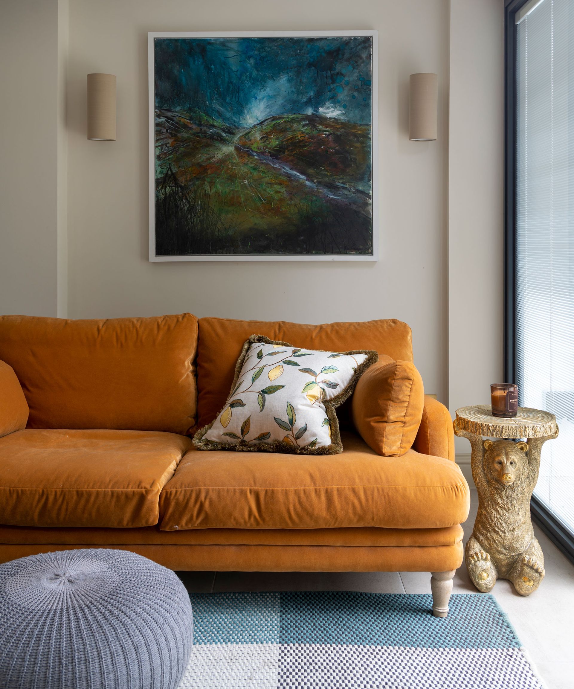
4. Comfort is always key
(Image credit: James Merrell)
This may sound obvious, but as someone who likes to spend a lot of time relaxing at home, comfort is always one of my number one priorities.
This covers everything from comfy seating in my living room, and accessorizing with cozy cushions, throws, and rugs, to ensuring that the overall flow and usability of the space are comfortable and practical.
Sophie Platts, founder of Floks (opens in new tab) shares the importance of using natural materials to create comfort in the home, ‘use natural materials where you can in your interiors. Not only will you create a soft, cozy, and inviting feel to your home, but you will improve your overall wellbeing as natural materials are better for our health. Cotton and wool are home furnishing heroes; they are sustainable and biodegradable and therefore have very little impact on the planet when they biodegrade at the end of their useful life.’
Artem Kropovinsky also explains how comfort can be centered around the functionality of your space, too. ‘Comfort is a key factor in interior design, as it affects the functionality and overall experience of the space. This can include comfortable seating, soft lighting, and the use of texture and color to create a welcoming and cozy atmosphere. Comfort is also about making sure a space is functional and meets the needs of those who use it. For example, a living room should have comfortable seating options, while a kitchen should have ample counter space and storage.’
5. Styling accessories in uneven numbers
(Image credit: Sarah Kaye Representation Ltd.)
‘Styling accessories in uneven numbers, such as grouping three or five items together, can make a space feel less rigid and more organic,’ says Lauren Czarniecki, owner and principal designer at Czar Interiors (opens in new tab).
Many of us will be familiar with the rule of three in interior design, as this is the magic number that often creates visually appealing and the most harmonious decorative displays when styling objects and ornaments on a shelf or surface.
This is not to say symmetry in interior design does not also look beautiful, but when it comes to styling a shelf in my home, creating a more natural and collected look and sticking to the rule of styling in uneven numbers, makes the space feel more homey and authentic, rather than staged.
Peter Erlandsson, co-owner of String Furniture (opens in new tab) says, ‘I believe we should all take pride in the objects we have collected throughout our lives. Whether it’s a collection of specific objects like crockery or crystal ware, or just sentimental bits and pieces, give your clutter a new lease of life. Every ornament, shell, fridge magnet, and dog-eared book can make up a mosaic of colorful references to your life.’
From books to magazines, pottery, and candles, these accessories and objects can often bring a whole scheme together, and ultimately make your space feel more unique and connected to you.
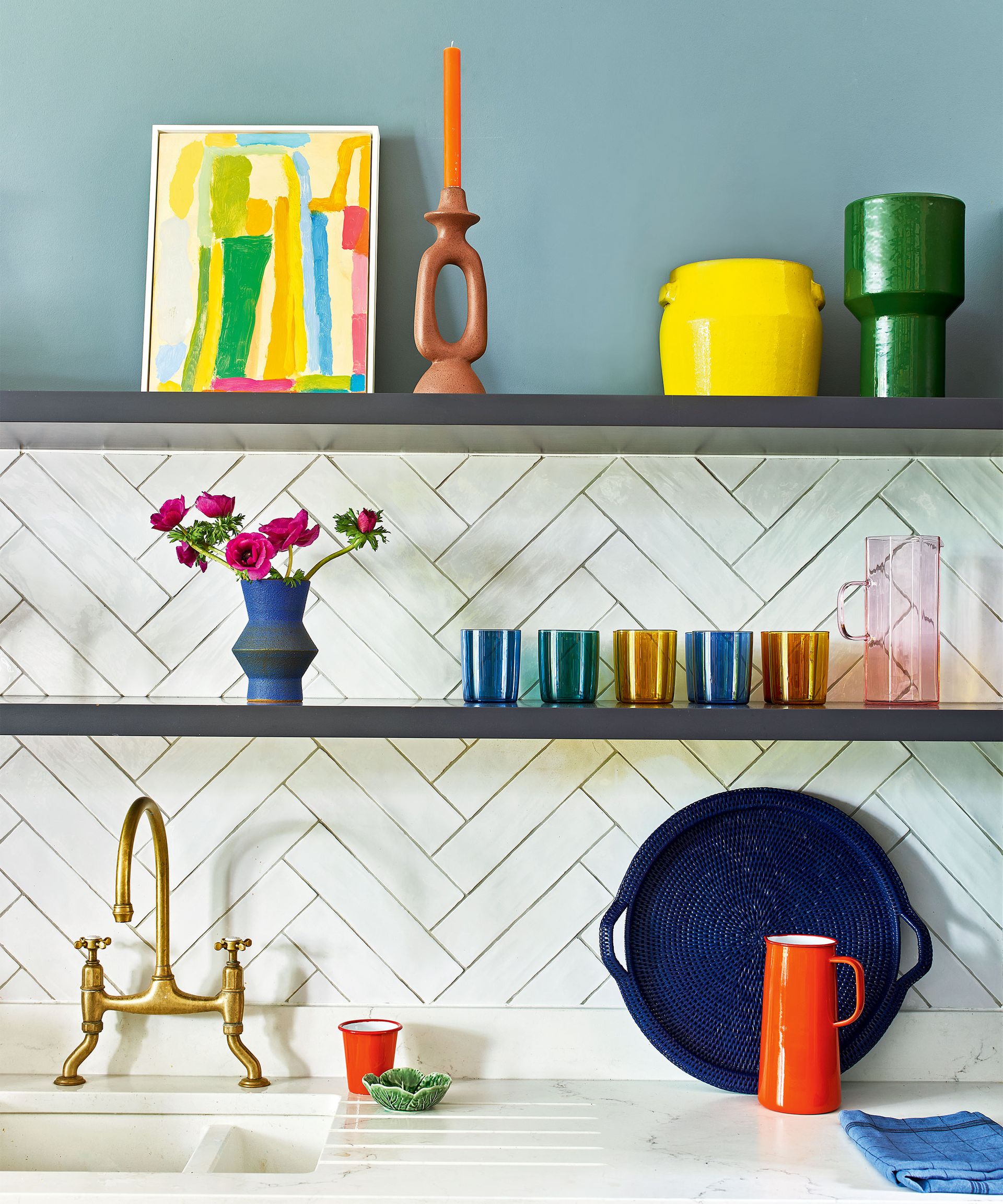
6. A cohesive color palette
(Image credit: James Merrell)
Color is key to bringing your home to life, and can affect everything from paint to furniture, upholstery, and accessories, and choosing a cohesive color palette will not only make things easier when styling your space, but it will also ensure that your scheme feels united and well thought through.
My apartment really is a celebration of pink room ideas, and all rooms are connected through my love for this color. However, a cohesive color palette does not mean you have to limit the colors you use or have a color that is present throughout the home (although pink is a wonderful choice if I do say so myself), it simply means making connections with color. From using contrasting complementary colors on the color wheel (think blue and yellow), to weaving an accent color across a room through the use of ornaments and cushions, carefully selecting your color choices can make for a truly beautiful interior design.
Interior designer, Artem Kropovinsky says; ‘a cohesive color palette can help create a harmonious and united look, tying a space together and making it feel finished. Choosing a limited color palette and using it consistently throughout a space can also help to create a cohesive look and give a room a sense of unity. This can be achieved by using a neutral base color and adding in pops of color through accent pieces, such as artwork or textiles.’
For more color insight, and exploration on how to create the perfect color scheme, explore how to use the 80/20 color rule when decorating.
What are the 7 principles of interior design?
The 7 principles of interior design are:
- Space – the distance between and around furniture and objects and their proportions within a room
- Line – how lines can influence the structure, size and focal points within a space
- Form – the shape of a room and the shapes found within
- Light – the presence of natural daylight and artificial illumination
- Color – the colors found in a space, through paint, furniture, accessories and more
- Texture – how the room feels as well as how it looks
- Pattern – adding artistic visual interest, color and life to a room
These elements are used in combination by interior designers to achieve a balanced and harmonious design scheme.
What is the 70/30 rule in design?
The 70/30 rule in interior design refers to splitting up a room in order to combine a collection of different styles and design ideas.
70{171d91e9a1d50446856093950b947460c67b1ae5766d3d173ffede4594e3fbfb} of the space covers your main or ‘anchor’ scheme, and the rest, 30{171d91e9a1d50446856093950b947460c67b1ae5766d3d173ffede4594e3fbfb}, covers a different style or theme.
This union of designs will make for both a grounding and more visually interesting space. The rule caters to elegant and creative elements of contrast, whether that be through paint ideas, furniture, or decorative accessories such as artwork and ornaments.


